Details about Hover.dev - Animated UI Components
Collection of prebuilt UI components with animations
Built for React, Tailwind CSS, and Framer Motion
Focuses on accessibility, interactions, and customization
Offers free and paid plans for access
Developed by Hover.dev with community engagement
#What is Hover.dev?
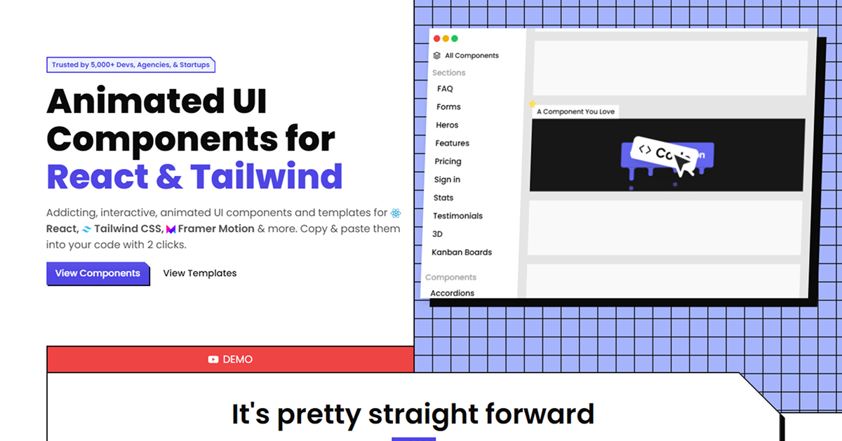
Hover.dev is a collection of animated UI components and templates created by the Hover.dev team, designed to help developers build engaging user interfaces with React and Tailwind CSS. Its primary goal is to save development time by providing prebuilt, customizable components with interactions and animations, targeting developers working on modern web applications, dashboards, or SaaS platforms.
The library includes components like buttons, forms, progress bars, and sign-in sections, all enhanced with Framer Motion for smooth animations. With a focus on accessibility and developer experience, Hover.dev offers both free and paid plans, allowing users to access a range of components and interactions to streamline their workflow.
#Features ⚡️
Animated Components: Includes buttons, forms, progress bars, and more with Framer Motion animations.
React and Tailwind CSS: Built for seamless integration with React and styled with Tailwind CSS.
Accessibility Focus: Designed with accessibility in mind, though specific WAI-ARIA compliance isn’t detailed.
Customizable: Components can be styled and adjusted using Tailwind CSS utilities.
Interactive Templates: Offers sections like sign-in forms, hero sections, and Kanban boards with animations.
Free and Paid Plans: Free access to basic components, with pro plans for advanced features.
#Pros and Cons
#Pros ✅
Time-Saving: Prebuilt components with animations reduce development time.
Modern Stack: Uses React, Tailwind CSS, and Framer Motion for a contemporary workflow.
Customizable: Tailwind CSS allows easy styling adjustments.
Developer-Friendly: Focuses on interactions, letting developers prioritize core product features.
Refund Policy: Offers a 30-day refund for paid plans, no questions asked.
#Cons ⚠️
Framework Dependency: Limited to React and Tailwind CSS projects.
Paid Features: Advanced components require a pro plan, with pricing details on their site.
Limited Accessibility Details: Lacks explicit WAI-ARIA compliance information.
Learning Curve: May require familiarity with Framer Motion for advanced customization.
#Included Components - Templates
Hover.dev provides a variety of UI components and templates:
Buttons: Animated buttons with hover effects and variants.
Forms: Interactive form components with animations for sign-in and other uses.
Progress Bars: Dynamic progress components with customizable animations.
Sections: Templates like hero sections, FAQ sections, and Kanban boards with interactions.
#Pricing 💵
Hover.dev operates on a Freemium model:
Free Access: Basic components are available for free.
Pro Plans: Advanced components and templates require a paid subscription,
$149$49/forever
#Integrations 🧰
Hover.dev integrates with:
React: Core framework for building components.
Tailwind CSS: Utility-first styling for all components.
Framer Motion: Animation library for smooth, interactive effects.
Next.js: Compatible with Next.js projects for seamless integration.
Frequently Asked Questions
What is Hover.dev, and how does it work with Tailwind CSS?
Hover.dev is a collection of animated UI components for React, styled with Tailwind CSS for easy customization and responsive design.
Is Hover.dev free to use?
It offers a free tier for basic components, with advanced features available via paid pro plans.
Can I use Hover.dev with frameworks other than React?
No, it’s designed specifically for React projects.
Does Hover.dev support animations?
Yes, it uses Framer Motion to add smooth animations to components.
Hover.dev - Animated UI Components
Animated UI Components for React & Tailwind CSS.
Resource Types:
UI Kits :
Tailwind UITechnology Stack :


Have a resource?
Submit your Tailwind CSS resource to All UtilityCSS, get featured, and drive genuine traffic while showcasing your work to the world. Turn your creativity into revenue and begin selling today! 🚀