Details about Preline UI - Tailwind CSS components library
Free, open-source Tailwind CSS library with 640+ components, 220+ starter pages/examples, and 5 ready-to-use templates.
Pro version unlocks 780+ examples and 21 premium templates for advanced needs.
Built for HTML, React, and Vue, with full dark mode support and mobile-first responsiveness.
Includes a comprehensive Figma design system—the largest free one available—for seamless handoff from design to code.
Emphasizes accessibility, high-quality UI blocks, and plugins to accelerate website building.
#What is Preline UI?
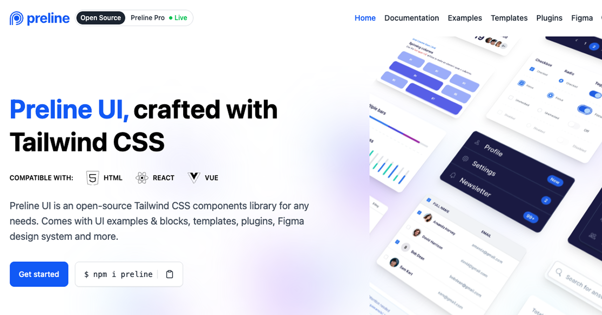
Preline UI is a robust, open-source Tailwind CSS components library designed to empower developers and designers in crafting modern, responsive websites without starting from scratch. It provides a vast collection of pre-built UI elements, examples, and templates that integrate effortlessly into any Tailwind-based project, saving hours on styling and layout. Ideal for building everything from landing pages to full apps in HTML, React, or Vue, Preline stands out with its accessibility-focused components, dark mode variants, and a dedicated Figma design system for collaborative workflows. As a free resource (with optional Pro upgrades), it's perfect for indie devs, agencies, or teams seeking production-ready assets that prioritize speed, consistency, and visual polish—often praised for delivering "premium" quality at no cost.
#Features ⚡️
Extensive Component Library: 640+ Tailwind-powered elements like buttons, cards, navbars, and forms, all accessible and customizable.
Dark Mode Ready: Built-in variants for seamless light/dark theme switching across all components.
Starter Pages & Examples: 220+ ready-to-adapt layouts for heroes, dashboards, and e-commerce sections.
Figma Design System: The largest free Figma kit with Tailwind styles, components, and extras for design-to-dev handoff.
Mobile-First Responsiveness: All assets optimized for desktop, tablet, and mobile with utility-class flexibility.
Plugins & Tools: Additional utilities for enhanced functionality, like advanced interactions and blocks.
#Pros ✅
Massive Free Value: 840+ components/examples rival paid libraries, accelerating builds dramatically.
Framework Versatility: Works anywhere Tailwind does—HTML, React, Vue—without JS bloat.
Accessibility Built-In: Meets WCAG criteria out of the box, reducing manual compliance work.
Figma Integration: Free, expansive design system bridges designers and devs effortlessly.
Customization Freedom: Pure Tailwind utilities for infinite tweaks without overriding styles.
#Cons ⚠️
Tailwind Exclusive: Requires Tailwind setup—not suitable for vanilla CSS or other frameworks.
Pro Gated Extras: Advanced templates (21 total) and 780+ examples require upgrade for full access.
No Built-in JS Logic: Styling-focused; pair with Headless UI for interactive behaviors.
Learning Curve for Figma: Design system is powerful but may overwhelm non-Figma users.
Community-Driven Updates: Open-source pace depends on contributions, potentially slower than commercial tools.
#Included Components - Templates
Preline UI delivers a comprehensive free tier with modular, copy-paste-ready assets:
Components: 640+ essentials like buttons (variants: primary, ghost, outline), cards (with images/headers), forms (inputs, selects, checkboxes), navigation (navbars, sidebars, tabs), alerts, badges, modals, tables, and carousels—all responsive and dark-mode enabled.
UI Blocks & Examples: 220+ starter sections for heroes, footers, pricing grids, testimonials, and feature lists.
Templates: 5 free full-page starters (e.g., marketing landing, blog dashboard, e-commerce product page).
Figma Kit: Largest free design system with styled components, auto-layouts, and Tailwind color variables.
Pro adds 16 more templates and expanded examples for complex apps.
#Pricing 💸
Preline UI follows a Freemium model to balance accessibility with premium depth
Free Tier: Open-source core with 640+ components, 220+ examples, 5 templates, and full Figma system—no limits on use.
Pro Version: $99/year (or equivalent one-time options) unlocks 780+ advanced examples, 21 professional templates, priority support, and exclusive blocks. Details at preline.co/pro—ideal for teams needing more polish.
All free assets are MIT-licensed for commercial use.
#Integrations 🧰
Tailored for Tailwind ecosystems:
Tailwind CSS: Core dependency—components use utilities for styling and responsiveness.
Frameworks: Native support for HTML, React (via JSX), and Vue (with SFC templates).
Figma: Dedicated design system for prototyping and export to code.
Build Tools: Vite, Webpack, or Next.js for bundling; no JS runtime needed.
Headless UI: Complements for behaviors like dropdowns or modals.
Plugins: Built-in utilities for enhanced Tailwind functionality.
Frequently Asked Questions
What is Preline UI?
An open-source Tailwind CSS library with 640+ accessible components, 220+ examples, and Figma tools for fast website building.
How is it free?
Core library is open-source; Pro funds extras like advanced templates—users rave about the generous free quality.
Does it support dark mode?
Yes—all components include dark variants via Tailwind's dark: prefix.
Preline UI - Tailwind CSS components library
An open-source Tailwind CSS components library for any needs.
Resource Types:
UI Kits :
Tailwind UITechnology Stack :


Have a resource?
Submit your Tailwind CSS resource to All UtilityCSS, get featured, and drive genuine traffic while showcasing your work to the world. Turn your creativity into revenue and begin selling today! 🚀