Details about Skiper UI - Un-common Components
Built with React, TypeScript, Tailwind CSS, and ShadCN UI
Features animated components with Framer Motion effects
Supports copy-paste integration via ShadCN CLI
Premium React components
#What is Skiper UI?
Skiper UI is a UI component library designed to help developers create visually stunning, animated interfaces with minimal effort. Its primary goal is to provide reusable, customizable components for rapid UI development, targeting React developers building modern web applications like landing pages, SaaS platforms, or dashboards. Built with React, TypeScript, Tailwind CSS, and Framer Motion, Skiper UI integrates seamlessly with ShadCN UI, offering animated components like card swipers, theme toggles, and marquees. It emphasizes a copy-paste approach, allowing developers to integrate components directly into their projects via the ShadCN CLI. For the ShadCN ecosystem, Skiper UI is a perfect fit, leveraging ShadCN UI’s accessible foundation to deliver polished, motion-rich components for React applications.
#Features ⚡️
Animated Components: Card swipers, marquees, and buttons with Framer Motion effects.
ShadCN UI Integration: Builds on ShadCN UI for accessible, customizable components.
Accessibility: Inherits ShadCN UI’s WAI-ARIA compliance with Radix UI primitives.
CLI Support: Add components with npx shadcn@latest add for quick setup.
Responsive Design: Tailwind CSS ensures components adapt to all screen sizes.
Type Safety: TypeScript ensures robust, error-free development.
#Pros and Cons
#Pros ✅
Visually Stunning: Animations via Framer Motion add a premium feel to interfaces.
ShadCN UI Fit: Perfect for ShadCN projects with its React and ShadCN UI foundation.
Community Support: 28 upvotes on Product Hunt and active engagement.
Easy Integration: Copy-paste model with CLI simplifies adding components.
#Cons ⚠️
React Dependency: Limited to React projects, though fitting for ShadCN.
Setup Complexity: Requires ShadCN UI, Tailwind CSS, and Framer Motion to be pre-installed.
Performance Overhead: Animations may impact performance on low-end devices.
Learning Curve: Familiarity with ShadCN UI, React, and TypeScript needed for effective use.
#Included Components - Templates
Skiper UI provides a variety of ShadCN UI-powered components:
Card Swipe: Animated carousel with Swiper.js for image transitions.
Theme Toggle: Interactive light/dark mode switcher with animations.
Slide Button: Button with sliding effects for user engagement.
Marquee: Scrolling content display with customizable directions.
#Pricing 💵
Skiper UI operates on a premium model:
Premium: $129
Exclusive: $549 (includes figma file and full website template
#Integrations 🧰
Skiper UI integrates with:
React: Core framework for building components.
ShadCN UI: Accessible component library for styling and structure.
Tailwind CSS: Utility-first styling for responsive design.
Framer Motion: Animation library for smooth effects.
Next.js: Supports server-side rendering and routing.
Frequently Asked Questions
What is Skiper UI, and how does it work with ShadCN UI?
Skiper UI is a UI library for React, built on ShadCN UI, offering animated components for stunning interfaces.
Can I use Skiper UI with frameworks other than React?
No, it’s designed for React, aligning with ShadCN UI’s ecosystem.
Does Skiper UI support accessibility?
Yes, it inherits ShadCN UI’s WAI-ARIA compliance via Radix UI.
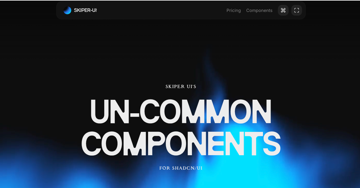
Skiper UI - Un-common Components
Discover 73+ premium React components built on shadcn/ui.
Resource Types:
UI Kits :
Shadcn UITechnology Stack :


Have a resource?
Submit your Tailwind CSS resource to All UtilityCSS, get featured, and drive genuine traffic while showcasing your work to the world. Turn your creativity into revenue and begin selling today! 🚀