Details about Wedges - Open-source UI components
Free, open-source React UI component library
Built with Wedges Design System, Radix UI, and Tailwind CSS
Focuses on accessibility, customization, and TypeScript support
Supports light/dark modes and theming
MIT-licensed with active community contributions
#What is Wedges?
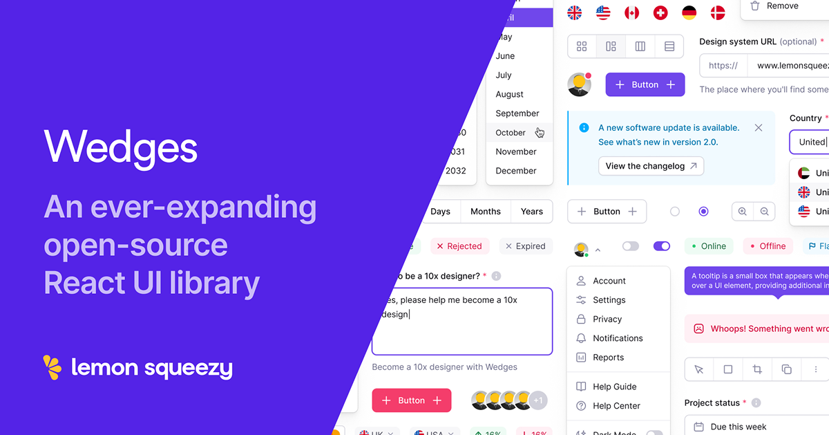
Wedges is a free, open-source React UI library developed by Lemon Squeezy, designed to simplify the process of building modern, accessible, and beautiful user interfaces. Its primary goal is to provide developers with a growing collection of pre-built, customizable components that integrate seamlessly into React projects, targeting those working on dashboards, SaaS platforms, or any React-based application.
The library combines the Wedges Design System for consistent aesthetics, Radix UI primitives for accessibility, and Tailwind CSS for utility-first styling. With features like TypeScript support, light/dark mode switching, and theming capabilities, Wedges aims to save development time while ensuring pixel-perfect, WAI-ARIA compliant interfaces.
#Features ⚡️
Accessible Components: Built with Radix UI, ensuring WAI-ARIA compliance for screen readers and keyboard navigation.
Customizable Theming: Tailwind CSS plugin allows easy theme creation and switching.
Light/Dark Mode: Toggle between modes using the "dark" class or automatically.
TypeScript Support: Fully typed for better developer experience and error prevention.
Pre-Built Components: Includes buttons, alerts, inputs, and select components for rapid development.
Pixel-Perfect Design: Crafted by world-class designers for professional-grade interfaces.
#Pros and Cons
#Pros ✅
Accessibility: WAI-ARIA compliant out of the box, supporting assistive technologies.
Free and Open-Source: MIT license allows unrestricted use and modification.
Customizable: Tailwind CSS and theming support make styling adjustments easy.
Community Support: Backed by Lemon Squeezy with active contributions on GitHub.
TypeScript Integration: Reduces errors and improves development efficiency.
#Cons ⚠️
React Dependency: Limited to React projects, not suitable for other frameworks.
Tailwind Requirement: Requires Tailwind CSS setup, adding complexity for non-Tailwind users.
Learning Curve: Understanding Radix UI and theming may take time for beginners.
Component Gaps: Still expanding, so some advanced components may be missing.
#Included Components - Templates
Wedges provides a collection of reusable UI components:
Button: Customizable buttons with variants, sizes, and icon support in packages/wedges/src/components/Button/.
Alert: Styled alerts with closable options and color variants in packages/wedges/src/components/Alert/.
Input: Accessible input fields with labels and helper text in packages/wedges/src/components/Input/.
Select: Dropdown component added in v1.4.0, supporting theming and accessibility.
#Pricing 💵
Wedges operates on a Free model:
Free Access: Fully open-source under the MIT license, with no cost to use or modify.
#Integrations 🧰
Wedges integrates with:
React: Core framework for building components.
Tailwind CSS: Utility-first styling, with a custom plugin for theming.
Radix UI: Primitives for accessibility, used in components like Button and Alert.
Next.js: Compatible with both app and page routers, with a starter template.
Figma: Wedges Design System available for design workflows.
Frequently Asked Questions
What is Wedges, and how does it work with Tailwind CSS?
Wedges is a free React UI library built with the Wedges Design System, using Tailwind CSS for utility-first styling and theming capabilities.
Is Wedges free to use?
Yes, it’s fully free and open-source under the MIT license.
Can I use Wedges with frameworks other than React?
No, it’s designed specifically for React projects.
Does Wedges support dark mode?
Yes, it supports light/dark mode switching with a single class or automatically.
Wedges - Open-source UI components
An open-source collection of UI components for React and Tailwind CSS.
Resource Types:
UI Kits :
Tailwind UITechnology Stack :


Have a resource?
Submit your Tailwind CSS resource to All UtilityCSS, get featured, and drive genuine traffic while showcasing your work to the world. Turn your creativity into revenue and begin selling today! 🚀