Details about ZenUI Library - Component Library
Free, open-source library of UI components built with Tailwind CSS
Includes customizable icons and a color palette
No dependencies required for integration
Copy-and-paste functionality for quick use
Supports responsive design with Tailwind CSS utilities
#What is ZenUI Library?
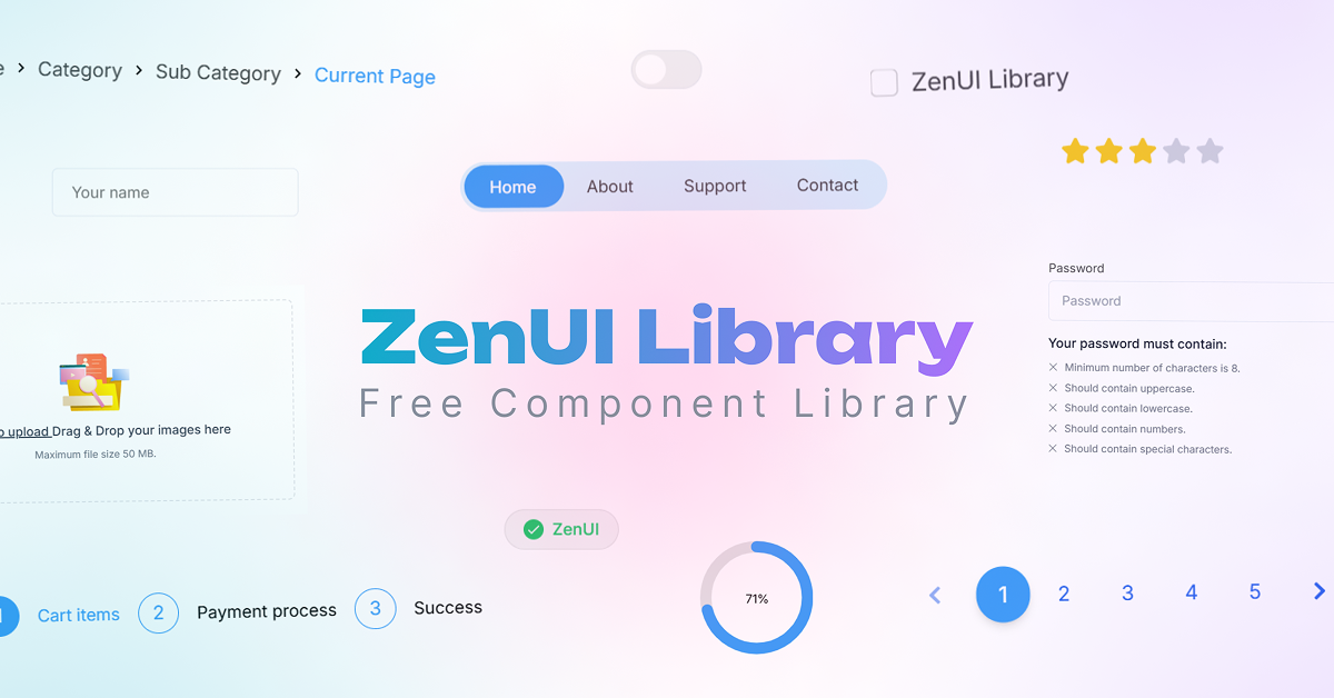
ZenUI Library is a free, open-source collection of UI components designed to simplify web development using Tailwind CSS. Its primary goal is to provide developers with a lightweight, dependency-free set of tools to elevate their projects without the overhead of complex setups.
Aimed at developers, startups, and freelancers, ZenUI offers customizable components, icons, and a color palette that can be seamlessly integrated into any Tailwind CSS project. While the library focuses on simplicity and ease of use, it’s distinct from ASUS ZenUI (a mobile interface for Android devices) and should not be confused with other similarly named tools.
#Features ⚡️
UI Components: A variety of pre-built elements like buttons, cards, and forms, styled with Tailwind CSS.
Customizable Icons: Includes a set of icons that can be tailored to fit your project’s design.
Color Palette: Offers a curated palette for consistent styling across components.
No Dependencies: Works without additional libraries, relying solely on Tailwind CSS.
Responsive Design: Leverages Tailwind CSS’s responsive utilities for cross-device compatibility.
Copy-and-Paste Integration: Easily integrate components by copying code directly into your project.
#Pros and Cons
#Pros ✅
Lightweight: No dependencies make it easy to integrate without bloating your project.
Free and Open-Source: Available at no cost, with potential for community contributions.
Tailwind CSS Integration: Seamlessly aligns with Tailwind’s utility-first approach.
Customizable: Icons, colors, and components can be adjusted to match your design needs.
Quick Setup: Copy-and-paste functionality speeds up development.
#Cons ⚠️
Limited Information: The website provides minimal details on the full scope of components or updates.
Tailwind Dependency: Requires a Tailwind CSS setup, limiting its use for non-Tailwind projects.
Basic Features: May lack advanced interactivity or complex components compared to larger libraries.
No Clear Roadmap: Lacks visible documentation on future updates or community support.
#Included Components - Templates
ZenUI Library focuses on providing reusable UI elements:
Components: Buttons, cards, forms, modals, and navigation bars, all styled with Tailwind CSS.
Icons: A customizable icon set for common UI needs (e.g., navigation, actions).
Color Palette: Predefined colors that can be applied across components for consistency.
Code Snippets: HTML snippets with Tailwind CSS classes for direct integration.
#Pricing 💵
ZenUI Library operates on a Free model:
Free Access: Fully open-source with no cost to use or modify, as stated on the website.
#Integrations 🧰
ZenUI Library integrates with:
Tailwind CSS: Built specifically for Tailwind CSS, likely compatible with v4 based on current standards.
Frontend Frameworks: Works with HTML, React, Vue, or any framework supporting Tailwind CSS.
Browsers: Supports modern browsers like Chrome, Edge, Safari, and Firefox, given Tailwind’s compatibility.
Frequently Asked Questions
What is ZenUI Library, and how does it work with Tailwind CSS?
ZenUI Library is a free collection of UI components styled with Tailwind CSS, allowing developers to copy and paste elements into their Tailwind projects for quick integration.
Is ZenUI Library free to use?
Yes, it’s completely free and open-source, as noted on the website.
Can I use ZenUI Library with frameworks like React or Vue?
Yes, it works with any framework that supports Tailwind CSS, including React and Vue, by copying the HTML snippets.
Is ZenUI Library responsive?
Yes, it leverages Tailwind CSS’s responsive utilities to ensure components adapt across devices.
ZenUI Library - Component Library
Free, open-source library of UI components built with Tailwind CSS
Resource Types:
UI Kits :
Tailwind UITechnology Stack :


Have a resource?
Submit your Tailwind CSS resource to All UtilityCSS, get featured, and drive genuine traffic while showcasing your work to the world. Turn your creativity into revenue and begin selling today! 🚀