Details about Final UI
A comprehensive Figma design system & UI‑kit built for web apps, MVPs, and desktop apps.
Contains 500+ components & variants, 60+ page templates, supports light/dark modes.
Developer‑friendly: organised structure, atomic design approach, customisation via variables.
Designed for designers & developers to speed up UI workflows, especially for product tooling (SaaS, fintech, dashboards).
#What is Final UI?
Final UI is a premium‑grade design system and UI kit crafted primarily for the Figma environment. Its goal is to provide a full set of reusable, well-organised UI components, templates, and layouts that help designers and frontend developers build consistent, scalable web applications quickly. Whether you're working on a dashboard, SaaS admin panel, MVP, or desktop‑style web app, Final UI aims to reduce time spent building UI from scratch and promote design‑to‑development cohesion.
It emphasises atomic design (small reusable components → patterns → pages)and provides both light and dark themes, token/variable support, and front‑end friendliness (so designs map more easily to coded components). For startups, product teams, or agencies looking to iterate fast and ship UI faster, it offers a ready foundation.
#Features ⚡️
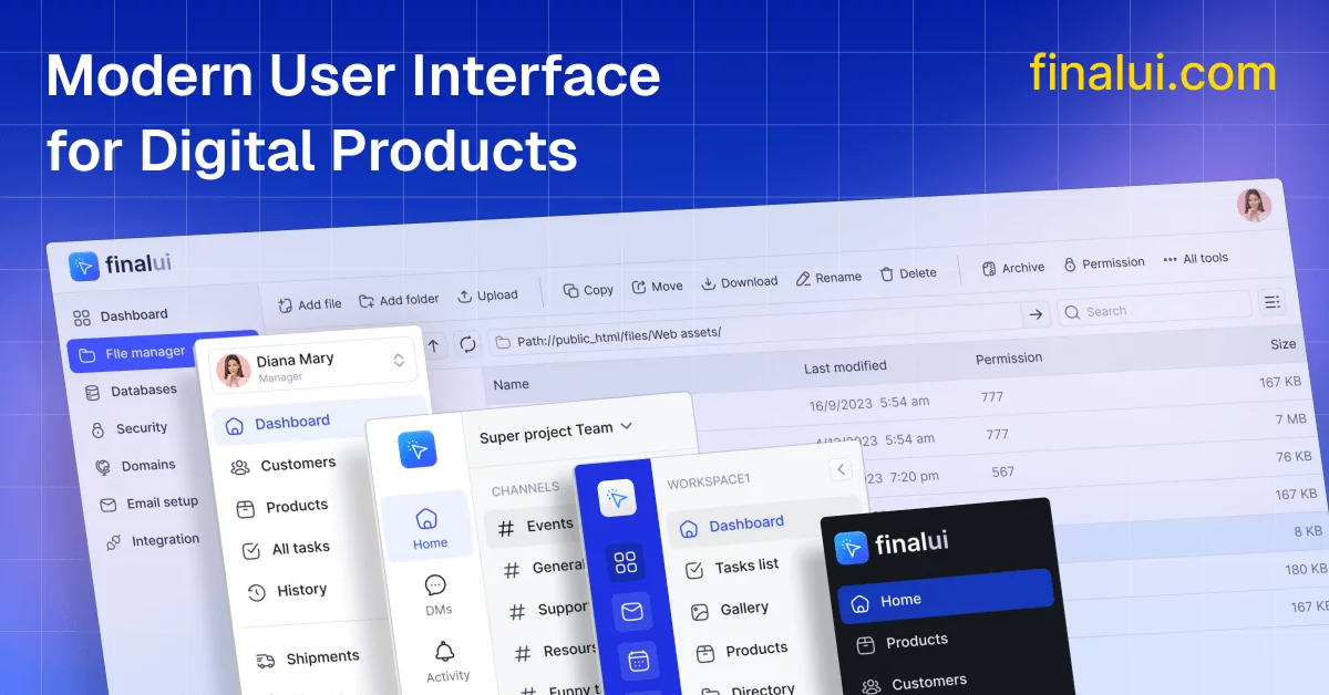
500+ components & variants: A large collection of UI building blocks – buttons, inputs, cards, grids, modals, dashboards.
60+ page templates: Pre‑designed pages/layouts for common UI flows (settings pages, lists, detail views, forms) to accelerate workflow.
Light & Dark modes: Built‑in theme modes, with the ability to toggle and adjust via Figma variables.
Atomic/Modular structure: Components are organised with atomic design in mind (atoms, molecules, organisms), making them highly reusable and systematic.
Developer‑friendly file structure: Well‑named Figma pages, layers, styles – designed for hand‑off and integration.
Customisation support: Change typography, colours, variables; adapt to brand or front‑end design system easily.
Commercial usage & updates: One‑time purchase/lifetime access plan or monthly subscription – includes updates and bonus templates.
#Pros and Cons
#Pros ✅
Saves significant time – you get a large library of ready‑made components and templates.
High level of customisation/flexibility – you can tailor to brand identity and front‑end system.
Good for coordination between design & development – the organisation makes the handoff smoother.
Supports modern design workflows (dark‑mode, design tokens/variables) – future‑proof.
Offers pricing flexibility (subscription or one‑time) so smaller teams/startups can adopt without heavy upfront cost.
#Cons ⚠️
It’s primarily built for Figma only (as of the latest info), so if your design team uses Sketch, Adobe XD or other tools, integration may be limited.
If your project is extremely lightweight/simple, the full system might be overkill (many components to sift through).
Depending on your front‑end stack (e.g., if you’re using something exotic beyond standard web), the mapping between Figma kit and coded components still needs bridging (you’ll still need front‑end development work).
#Included Components – Templates
Final UI includes a wide variety of templates and components. Some examples:
Hero sections, pricing tables, feature lists (for marketing/site landing pages).
Dashboards: list views, table views, kanban boards, charts, map views, calendar views.
Settings pages, detail views, forms (input, selects, toggles), modals.
UI patterns like cards, grid layouts, split‑window views, and filter panels.
Light and Dark mode variants built in.
Full page templates you can duplicate to start a project quickly (60+ pages).
Icons (500+ icons included) and common UI elements.
#Pricing 💵
Final UI offers free access to its design system and resources without any subscription or payment required.
#Integrations 🧰
Built for Figma (design files, variables, auto layout).
Designed to be “developer‑friendly”, meaning you can map components to front‑end code – though explicit frameworks (React, Vue, Tailwind) are not heavily publicised yet.
The documentation states, “You’ll be notified when HTML & CSS versions are released” for users.
Since it supports design tokens/variables, it can integrate well if your front‑end uses a token‑based system (e.g., Tailwind CSS, CSS variables) – you’ll likely need to build the coded component layer yourself, but you benefit from the structured design file.
Works well for startups, design teams, and agencies where design & hand‑off to developers is key.
Frequently Asked Questions
Is Final UI only for web‑apps? Or can I use for mobile apps too?
The focus is primarily web apps, dashboards, desktop apps, MVPs. While some components may work for mobile, the system is optimized for web‑style layouts.
Do I need to be expert in Figma to use it?
You should be comfortable with Figma since this kit leverages variables, auto layout, and organized libraries. While it's built to be straightforward, familiarity with Figma workflows helps.
Final UI
The Final Resources for Designers & UI Developers
Resource Types:
UI Kits :
Tailwind UITechnology Stack :


Have a resource?
Submit your Tailwind CSS resource to All UtilityCSS, get featured, and drive genuine traffic while showcasing your work to the world. Turn your creativity into revenue and begin selling today! 🚀