Details about Modall: React Icon Picker
Modern React Icon Picker: Built with ShadCN components and TailwindCSS.
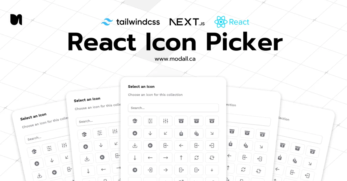
Searchable Interface: Includes a built-in search bar for quick icon selection.
Customizable Design: Easily styleable to match your application's theme.
Lightweight and Efficient: Optimized for performance with minimal dependencies.
Open Source: Free to use and modify under the MIT license.
#What is Modall?
The Modall is an open-source React component designed to simplify the process of integrating icon selection into your applications. Developed by Modall, this component leverages ShadCN UI components and TailwindCSS, ensuring a modern, responsive, and customizable interface. It's particularly well-suited for Next.js projects, offering a seamless integration experience.
#Features ⚡️
Built-in Search: Quickly filter through icons to find the desired one.
Customizable Trigger: Use any React component as the trigger for the picker.
Dark Mode Support: Automatically adapts to dark mode settings.
Responsive Design: Ensures usability across various device sizes.
TypeScript Support: Provides type safety for better developer experience.
#Pros and Cons
#Pros ✅
Seamless Integration: Easily integrates into existing React and Next.js projects.
Customizable: Tailor the appearance and behavior to fit your application's needs.
Open Source: Free to use and modify, encouraging community contributions.
Modern UI: Utilizes ShadCN and TailwindCSS for a sleek, contemporary interface.
#Cons ⚠️
Limited Icon Set: Initially supports a predefined set of icons; may require additional configuration for other icon libraries.
No Built-in Icon Upload: Does not support uploading custom icons out of the box.
#Included Components – Templates
The ShadCN Icon Picker provides the following components:
useIconPicker(): A hook for managing icon selection and search state.IconRenderer: A component for rendering the selected icon.IconPicker: A customizable component that combines the hook and renderer for easy integration.
#Pricing 💵
The Modall is free and open-source under the MIT license. No paid tiers or subscriptions are required.
#Integrations 🧰
React: Fully compatible with React applications.
Next.js: Optimized for Next.js projects.
TailwindCSS: Built using TailwindCSS for styling.
ShadCN UI: Utilizes ShadCN UI components for a consistent design system.
Frequently Asked Questions
Does it support multiple icon selection?
The current implementation supports single icon selection. For multiple selections, you would need to extend the component's functionality.
How do I install the ShadCN Icon Picker?
You can install it by copying the code directly into your project. Detailed instructions are available on the Modall Lab page.
Is it compatible with TypeScript?
Yes, the component is written in TypeScript and provides type definitions for better developer experience.
Modall: React Icon Picker
Curated open-source utilities and projects for community contribution.
Resource Types:
UI Kits :
Tailwind UITechnology Stack :


Have a resource?
Submit your Tailwind CSS resource to All UtilityCSS, get featured, and drive genuine traffic while showcasing your work to the world. Turn your creativity into revenue and begin selling today! 🚀