Details about Mvpblocks - Prebuilt UI blocks
Free, open-source UI component library
Built with React, Next.js, Framer Motion, and Tailwind CSS
Features 100+ pre-built, responsive UI blocks
Copy-paste ready with utility-first styling
BSD 3-Clause licensed, developer-focused
#What is Mvpblocks?
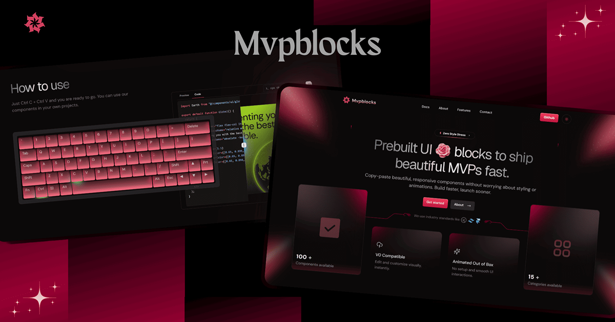
Mvpblocks, created by Subhadeep (Subha), is a free, open-source UI component library designed for developers to launch MVPs, landing pages, or SaaS projects quickly. Built with React, Next.js, Framer Motion for animations, and Tailwind CSS for utility-first styling, it offers over 100 responsive blocks like buttons, modals, and hero sections. Mvpblocks fits the All UtilityCSS platform’s Tailwind CSS List, ideal for developers seeking a frictionless, utility-first approach to building modern web interfaces.
#Features ⚡️
Extensive Component Library: 100+ blocks, from buttons to dashboards, styled with Tailwind CSS.
Tailwind CSS Integration: Utility-first classes for layout, colors, and responsiveness.
Copy-Paste Ready: No installation needed; copy components directly into your project.
Responsive Design: Optimized for all screens with Tailwind’s sm:, md: utilities.
Seamless Animations: Framer Motion for smooth effects, styled via Tailwind.
CLI Support: Add components via npx shadcn@latest add for faster integration.
#Pros and Cons
#Pros ✅
Accelerates development with Tailwind CSS for utility-first styling.
Free under BSD 3-Clause license, aligning with All UtilityCSS’s open-source focus.
Developer-friendly with no installation required, just copy-paste.
Customizable with Tailwind CSS classes for layout and design.
Supports modern workflows with CLI and Next.js integration.
#Cons ⚠️
Requires Tailwind CSS setup for full functionality, adding initial steps.
React-only, limiting use in non-React projects.
Animations via Framer Motion may impact performance on low-end devices.
Basic documentation; relies on Tailwind and Next.js guides for deeper customization.
#Included Components - Templates
Mvpblocks offers a wide range of UI components:
Button: Creative buttons styled with Tailwind’s px-4 py-2 bg-blue-500.
Modal: Overlay elements for alerts, styled with Tailwind’s bg-white shadow-lg.
Hero Section: Pre-designed hero blocks with Tailwind’s bg-cover text-center.
Dashboard: Admin and user dashboards using Tailwind’s grid gap-4.
#Pricing 💵
Mvpblocks operates on a Free model:
Free Access: Fully open-source under BSD 3-Clause license, accessible via blocks.mvp-subha.me.
#Integrations 🧰
Mvpblocks integrates with:
React: Core framework for the library.
Next.js: Optimized for Next.js projects.
Tailwind CSS: Utility-first styling for responsive design.
Framer Motion: Powers animations for components.
ShadCN UI: Enhances component structure.
Frequently Asked Questions
What is Mvpblocks, and how does it use Tailwind CSS?
It’s a free UI component library for React, styled with Tailwind CSS for utility-first design.
Is Mvpblocks free to use?
Yes, it’s fully free under the BSD 3-Clause license.
Can I use Mvpblocks with frameworks other than React?
No, it’s designed for React, aligning with Tailwind CSS List.
Does Mvpblocks support accessibility?
Limited details, but Tailwind and ShadCN UI provide some accessibility features.
Mvpblocks - Prebuilt UI blocks
Copy-paste beautiful, responsive components with animations.
Resource Types:
UI Kits :
Tailwind UITechnology Stack :


Have a resource?
Submit your Tailwind CSS resource to All UtilityCSS, get featured, and drive genuine traffic while showcasing your work to the world. Turn your creativity into revenue and begin selling today! 🚀