Details about RetroUI - Component Library
Free, open-source retro-styled component library
Built with React and Tailwind CSS
Features 100+ components with neo-brutalism and pixelated aesthetics
Copy-paste ready with utility-first styling
MIT-licensed, with premium options available
#What is RetroUI?
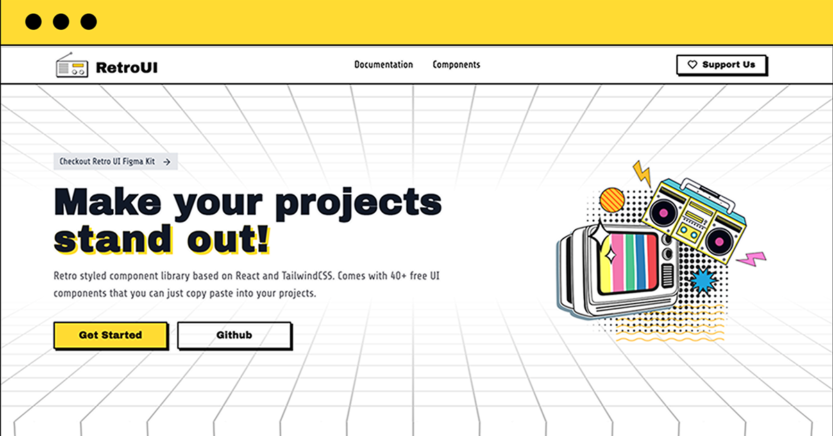
RetroUI is a free, open-source UI component library for React, designed to bring a nostalgic, retro-inspired aesthetic to modern web applications. It leverages Tailwind CSS for utility-first styling, offering over 100 components like buttons, cards, and modals with neo-brutalism and pixelated design elements. RetroUI fits the All UtilityCSS platform’s Tailwind CSS List, ideal for developers aiming to create unique, bold interfaces for projects like portfolios, dashboards, or creative apps.
#Features ⚡️
Retro Aesthetics: Neo-brutalism and pixelated designs, styled with Tailwind CSS.
Tailwind CSS Integration: Utility-first classes for layout, colors, and responsiveness.
Copy-Paste Ready: Components easily added via CLI or manual import.
Customizable: Tailwind CSS classes for styling adjustments (e.g., px-6 py-2).
Type Safety: TypeScript support for reliable development.
Responsive Design: Adapts to all screens with Tailwind’s sm:, md: utilities.
#Pros and Cons
#Pros ✅
Unique retro design with Tailwind CSS for utility-first styling.
Free core library under MIT license, aligning with All UtilityCSS’s open-source focus.
Easy integration with CLI (e.g., npx shadcn add retroui.dev/r/button.json).
Customizable with Tailwind CSS and TypeScript support.
Active community, with mentions on Reddit and Product Hunt (May 2025).
#Cons ⚠️
Requires Tailwind CSS setup, adding initial configuration steps.
React-only, limiting use in non-React projects.
Premium blocks and templates cost extra (pricing on pro.retroui.dev).
Fonts like Archivo Black and Space Grotesk need separate setup.
#Included Components - Templates
RetroUI provides a variety of retro-styled components:
Button: Bold buttons styled with Tailwind’s bg-[#c381b5] text-[#fefcd0].
Card: Pixelated cards with Tailwind’s p-4 shadow-lg.
Modal: Dialog boxes styled with Tailwind’s bg-white border.
Typography: Headings and text using Tailwind’s font-minecraft or custom fonts.
#Pricing 💵
RetroUI operates on a Freemium model:
Free Access: 100+ components free under MIT license.
Premium Access: Additional blocks, templates, and Figma kits (pricing on pro.retroui.dev).
#Integrations 🧰
RetroUI integrates with:
React: Core framework for the library.
Tailwind CSS: Utility-first styling for responsive design.
ShadCN UI: Built on ShadCN for component structure.
TypeScript: Ensures type safety.
Vite: Supported for fast development workflows.
Frequently Asked Questions
What is RetroUI, and how does it use Tailwind CSS?
It’s a free, retro-styled component library for React, using Tailwind CSS for utility-first design.
Is RetroUI free to use?
Yes, the core library is free under MIT license, with premium options.
Can I use RetroUI with frameworks other than React?
No, it’s designed for React, aligning with Tailwind CSS List.
RetroUI - Component Library
Retro styled component library built with React and TailwindCSS.
Resource Types:
UI Kits :
Shadcn UITechnology Stack :


Have a resource?
Submit your Tailwind CSS resource to All UtilityCSS, get featured, and drive genuine traffic while showcasing your work to the world. Turn your creativity into revenue and begin selling today! 🚀