Tailwind CSS Bento Grid
Discover Tailwind CSS bento grids for sleek, responsive layouts. Explore curated blocks at All UtilityCSS.
Explore Bento Grid


2+ Tailwind Bento Grid
Submit Resource
FlyonUI - Free Tailwind CSS Components
Open-source Tailwind CSS components library.

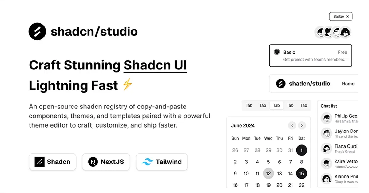
Shadcn/Studio - Theme Editor
Open-source Shadcn registry with copy-paste components.
Tailwind CSS Bento Grids for Modern Layouts
Tailwind CSS bento grids are visually appealing, asymmetrical layouts that organize content in a modular, grid-based format. Perfect for dashboards, portfolios, or landing pages, these grids leverage Tailwind’s utility classes for responsive, customizable designs. All UtilityCSS curates top free and premium Tailwind CSS bento grid resources to create engaging, modern web interfaces effortlessly.
What is Tailwind CSS Bento Grid?
Tailwind CSS bento grids are flexible, grid-based layouts inspired by bento box designs, featuring varied-sized content blocks arranged asymmetrically. Built with Tailwind’s utility classes, they use CSS Grid or Flexbox for responsive, modular displays of images, text, or cards. Ideal for showcasing features, products, or portfolios, bento grids offer dynamic, accessible designs without custom CSS.
Key Features
Customizable Layouts: Style grids with Tailwind’s spacing, sizing, and color utilities.
Responsive Design: Adapt seamlessly across mobile, tablet, and desktop devices.
Asymmetrical Blocks: Create visually engaging layouts with varied block sizes.
Interactive Elements: Add hover effects or clickable cards for dynamic UX.
Accessibility Support: Integrate ARIA attributes for inclusive user experiences.
Lightweight Code: Minimal markup ensures fast loading and reduced bloat.
Grid Flexibility: Use Tailwind’s grid or flex utilities for precise layouts.
Benefits of Using Tailwind CSS Bento Grid
Engaging Visuals: Asymmetrical layouts capture user attention with modern aesthetics.
Rapid Development: Utility classes enable quick grid creation without custom CSS.
Responsive Displays: Grids adapt to all screen sizes for consistent experiences.
SEO Optimization: Lightweight, semantic code boosts page speed and rankings.
Flexible Customization: Tweak block styles to match your brand’s identity.
Community Resources: All UtilityCSS offers curated bento grid blocks for inspiration.
Types of Tailwind CSS Bento Grid
Feature Grids: Highlight product or service features in varied block sizes.
Portfolio Grids: Showcase projects with asymmetrical image and text blocks.
Dashboard Grids: Organize widgets or data in modular, responsive layouts.
Content Grids: Display blog posts or articles in dynamic, card-based grids.
E-commerce Grids: Present products with mixed-size cards for visual appeal.
Gallery Grids: Arrange images or media in creative, asymmetrical layouts.
How to Choose the Best Tailwind CSS Bento Grid?
Verify Tailwind Compatibility: Ensure grids align with your Tailwind CSS version.
Check Layout Flexibility: Choose grids with customizable block sizes and arrangements.
Prioritize Responsiveness: Select grids with utilities for cross-device compatibility.
Evaluate Interactivity: Opt for grids with hover or clickable block features.
Confirm Accessibility: Ensure ARIA support for inclusive, user-friendly designs.
Popular Use Cases
Landing Pages: Create engaging hero sections with mixed-size content blocks.
Portfolio Websites: Showcase creative work in visually dynamic bento layouts.
E-commerce Stores: Display products with varied card sizes for visual interest.
Dashboards: Organize analytics or widgets in modular, responsive grids.
Blog Layouts: Present articles or categories in asymmetrical content grids.
Marketing Pages: Highlight features or campaigns with modern, bento-style layouts.
Final Thoughts
Tailwind CSS bento grids are a versatile solution for crafting modern, responsive, and visually captivating layouts. With All UtilityCSS, you can explore curated free and premium bento grid resources to streamline your development. Start building dynamic, user-friendly interfaces today with Tailwind CSS bento grids!
Frequently Asked Questions
Explore frequently asked questions about Bento Grid
Asymmetrical, grid-based layouts styled with Tailwind utilities for modular content.
Absolutely, utility classes allow easy tweaks for layout and style.
Have a resource?
Submit your Tailwind CSS resource to All UtilityCSS, get featured, and drive genuine traffic while showcasing your work to the world. Turn your creativity into revenue and begin selling today! 🚀