Tailwind CSS Components
Discover top Tailwind CSS components to speed up UI design. Get free and premium Tailwind components to speed up your development. Simply Copy and Paste in any tech you want.
Explore Components


66+ Tailwind Components
Submit Resource
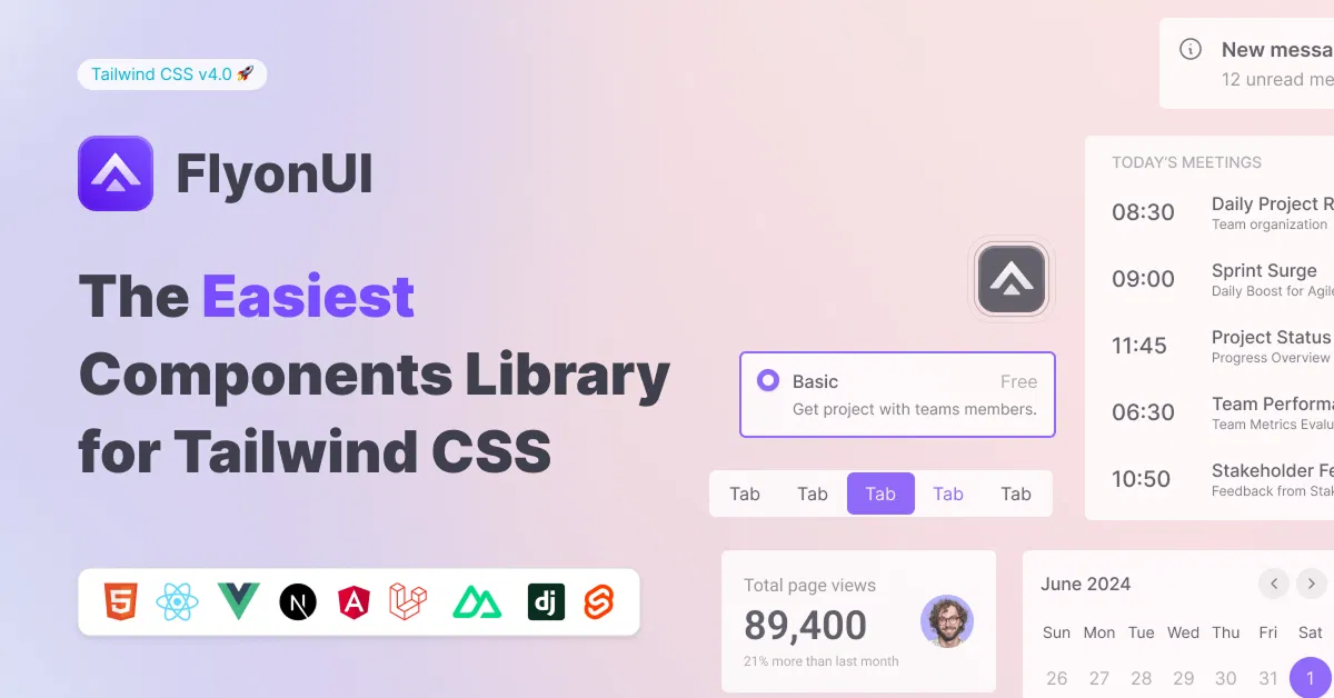
FlyonUI - Free Tailwind CSS Components
Open-source Tailwind CSS components library.

Next.js + Tailwind CSS + TypeScript Starter
An Open Source Next.js, Tailwind CSS, and TypeScript Boilerplate.

8bitcn/ui
Accessible retro components that you can copy and paste for your apps.

Tweakcn - Shadcn Theme Editor
Customize theme for shadcn/ui with tweakcn's interactive editor.

Shadcn for Vue - Shadcn/Vue
Beautifully designed components built with Radix Vue and Tailwind CSS.

JollyUI
Shadcn/UI components: accessible, customizable, open-source.

Origin UI - Beautiful UI components
Free, open-source, copy-paste components for building app UIs.

Cult UI – Shadcn UI Components & Templates
Open-source Shadcn UI components and templates for TypeScript/Next.js.

Circle by lndev-ui
Project management app, built with Next.js and Shadcn/UI.

Shadcn/Studio - Theme Editor
Open-source Shadcn registry with copy-paste components.

Tailwind Stamps - Resuable HTML Components
Open source collection of reusable TailwindCSS HTML Components.


Tailblocks — Ready-to-use CSS blocks
Ready-to-use Tailwind CSS blocks

Fancy Tailwind – Animated Components
Tailwind CSS Components that give something else to your websites.

Choc UI - Chakra UI Components
Prebuilt Chakra UI Components for faster development

Pines - Alpine and Tailwind UI Library
Library of animations, sliders, and modals for Alpine & Tailwind.

MynaUI Icons
Beautifully crafted open source icons for your next project.

RippleUI - TailwindCSS Components
Modern, clean Tailwind CSS components for a responsive, seamless UX.

Tailwind CSS Component Library | WindUI
Enhance projects with responsive UI components in React and HTML.

Explore The Best Tailwind Components at allutilitycss
Tailwind Components are ready-made UI elements built with Tailwind CSS to streamline web development. Whether you're crafting buttons, cards, modals, or navbars, these components save time and ensure design consistency. Explore allutilitycss' best collection of useful Tailwind css components that will help you build beautiful interfaces faster.
What is Tailwind Components?
Tailwind Components are pre-built UI blocks styled with Tailwind CSS utility classes. These components cover a wide range of design elements like headers, forms, modals, alerts, and more. Developers use them to quickly assemble responsive, customizable user interfaces without starting from scratch.
Key Features:
Fully responsive: Optimized for mobile, tablet, and desktop views.
Customizable: Easily tweakable using Tailwind's utility classes.
Lightweight code: Minimal HTML with utility-first styling.
Consistent design: Ensures uniformity across all UI parts.
Time-saving: Pre-built for rapid integration into projects.
Accessible: Often built with accessibility best practices.
Component variety: Includes buttons, forms, cards, navbars, and more.
Benefits of Using Tailwind Components
Speeds up development: Skip repetitive UI coding with plug-and-play components.
Boosts productivity: Focus more on functionality, less on styling from scratch.
Responsive by default: Components adapt to different devices seamlessly.
SEO-friendly design: Clean, semantic HTML supports better search engine indexing.
Highly maintainable: Modular design simplifies updates and scalability.
Consistent UI/UX: Ensures a cohesive look throughout the site.
Types of Tailwind Components
Navigation: Menus, sidebars, and navbars for seamless user journeys.
Forms & Inputs: Input fields, checkboxes, and full form layouts for user interactions.
Data Display: Cards, stats, badges, and other UI blocks for presenting information.
Data Tables: Responsive tables with sorting, filtering, and pagination features.
Charts & Graphs: Visual data representation using bar, line, and pie charts.
Authentication: Login, signup, and password reset form components.
Modals & Dialogs: Pop-ups for alerts, confirmations, and interactive overlays.
Customization Tips for Tailwind Components
Use Tailwind Config File: Extend or override default colors, fonts, and spacing in
tailwind.config.jsfor global consistency.Apply Utility Variants: Leverage
hover:,focus:,md:, and other variants for interactive and responsive styling.Combine Utilities Creatively: Stack multiple utility classes to fine-tune padding, margin, borders, and shadows.
Add Custom Classes Sparingly: Create custom CSS classes only when utility combinations become too verbose.
Use @apply for DRY Code: Use
@applyin your CSS files to reuse common Tailwind utility combos.Override Components Safely: When modifying components, duplicate and adjust rather than editing core files directly.
Leverage Plugins: Use Tailwind plugins (like forms, typography, aspect-ratio) for enhanced UI features.
Maintain Consistent Spacing: Stick to Tailwind's spacing scale (e.g.,
p-4,mb-6) for visual harmony.Use Dev Tools: Inspect and test component responsiveness directly in the browser as you customize
Examples:
1. Customize Colors via tailwind.config.js
// tailwind.config.js
module.exports = {
  theme: {
    extend: {
      colors: {
        primary: '#1e40af',
        secondary: '#facc15',
      },
    },
  },
}
Usage:
<button class="bg-primary text-white hover:bg-secondary">Click Me</button>2. Responsive & Interactive Styling
<div class="bg-white p-4 rounded-lg shadow-md hover:shadow-xl transition md:p-8">
  <p class="text-gray-700 text-sm md:text-lg">Responsive and interactive card</p>
</div>
3. @apply to DRY up Your Styles
/* styles.css */
.btn-primary {
  @apply bg-blue-600 text-white px-4 py-2 rounded hover:bg-blue-700;
}
Usage:
<button class="btn-primary">Primary Button</button>How to Choose the Best Tailwind Components?
Match your project style: Choose components that fit your brand’s design language.
Check responsiveness: Ensure the component looks good on all screen sizes.
Review accessibility: Opt for components built with accessibility standards.
Inspect code quality: Clean, semantic HTML and Tailwind classes are crucial.
Test customization options: Components should allow easy style adjustments.
Popular Use Cases
Landing pages: Use cards, buttons, and hero sections to create striking layouts.
Admin dashboards: Combine charts, tables, and navbars for clean backend UIs.
Ecommerce sites: Utilize product cards, filters, and modals.
Blogs and portfolios: Enhance content display with article blocks and image galleries.
Login/Signup pages: Speed up auth page creation with form components.
Get Started With the Best Tailwind CSS Components
Ready to build beautiful UIs faster? Browse our handpicked collection of Tailwind Components at allutilitycss. Whether you're a beginner or pro, these ready-to-use elements will supercharge your next project. Dive in and start designing with ease today!
Frequently Asked Questions
Explore frequently asked questions about Components
Tailwind components are pre-built UI elements styled using Tailwind CSS utility classes to speed up development.
Absolutely. Tailwind components work seamlessly with React, Vue, Angular, and other modern frameworks.
Have a resource?
Submit your Tailwind CSS resource to All UtilityCSS, get featured, and drive genuine traffic while showcasing your work to the world. Turn your creativity into revenue and begin selling today! 🚀