Tailwind CSS Footer Section
Find Tailwind CSS Footer Section templates for sleek, customizable, and responsive website footers that enhance user navigation and branding.
Explore Footer


2+ Tailwind Footer
Submit Resource
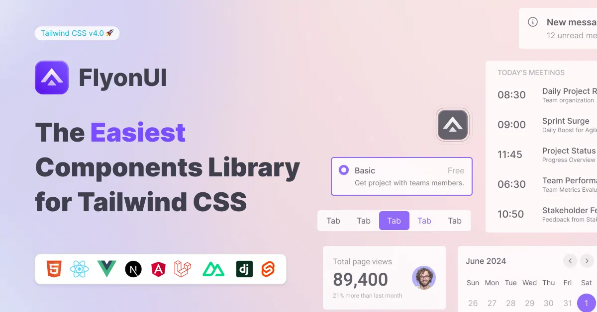
FlyonUI - Free Tailwind CSS Components
Open-source Tailwind CSS components library.

Shadcn/Studio - Theme Editor
Open-source Shadcn registry with copy-paste components.
Tailwind CSS Footer Section: Clean & Responsive Website Footers
Tailwind CSS Footer Sections provide essential website components that enhance navigation, branding, and user trust. Footers built with Tailwind are highly customizable and responsive, offering a perfect way to display contact info, links, and social media clearly at the bottom of any site.
What is Tailwind CSS Footer Section?
A Tailwind CSS Footer Section is a styled webpage footer built using Tailwind utility classes. It typically contains navigation links, copyright info, social icons, and sometimes newsletter sign-ups or contact forms. These footers are designed to be fully responsive and easy to customize, fitting seamlessly into any Tailwind-based project.
Key Features
Responsive layouts: Adapts to all screen sizes effortlessly.
Link organization: Groups navigation links into clear, accessible sections.
Social media integration: Includes icons with hover effects for engagement.
Customizable styling: Easily change colors, fonts, and spacing using Tailwind classes.
Sticky or static options: Support for footers that stay fixed or scroll naturally.
Accessibility-ready: Semantic HTML with keyboard and screen reader support.
Newsletter forms: Optional inclusion of email subscription forms for user retention.
Benefits of Using Tailwind CSS Footer Section
Enhanced site navigation: Footer menus help users explore your site further.
Improved branding: Consistent footer design strengthens brand identity.
Boosted SEO: Structured footer links assist search engines in crawling your site.
Quick customization: Utility-first Tailwind CSS allows fast design tweaks without extra CSS.
Mobile optimized: Ensures footers look clean and usable on all devices.
User trust: Displays contact info and policies clearly, increasing credibility.
Types of Tailwind CSS Footer Section
Simple Text Footer: Minimalist footer with copyright and basic links.
Multi-column Footer: Organized columns for links, resources, and contact details.
Social Media Footer: Focuses on social icons with interactive hover effects.
Newsletter Footer: Includes email signup forms for marketing campaigns.
Sticky Footer: Fixed footer that remains visible as users scroll the page.
Dark Mode Footer: Footer styled specifically for dark-themed websites.
How to Choose the Best Tailwind CSS Footer Section?
Tip 1: Consider content needs – Choose a footer layout that fits your links and info volume.
Tip 2: Prioritize mobile usability – Ensure the footer is easy to navigate on smaller screens.
Tip 3: Check customization flexibility – Look for footers built with Tailwind utilities for easy style changes.
Tip 4: Evaluate accessibility – Pick footers with proper semantic tags and keyboard navigation.
Tip 5: Match site theme – Select designs that complement your overall website style.
Popular Use Cases
Corporate websites: Display company info, policies, and navigation links.
E-commerce stores: Highlight customer service, return policies, and social links.
Blogs: Show categories, recent posts, and social media icons.
Portfolio sites: Present contact details and social profiles clearly.
SaaS platforms: Include legal disclaimers, support links, and newsletter signups.
Final Thoughts
Enhance your website’s usability and professionalism with All UtilityCSS’s wide selection of Tailwind CSS Footer Section resources. Whether you need a minimalist footer or a feature-rich multi-column layout, these components provide easy customization and responsive design to fit any project. Start building your perfect footer today!
Frequently Asked Questions
Explore frequently asked questions about Footer
Yes, many footer templates support embedded forms styled with Tailwind utilities.
Use Tailwind’s responsive prefixes (like sm:, md:, lg:) to adjust layout on different screens.
Have a resource?
Submit your Tailwind CSS resource to All UtilityCSS, get featured, and drive genuine traffic while showcasing your work to the world. Turn your creativity into revenue and begin selling today! 🚀