Tailwind CSS Shadow
Discover Tailwind CSS shadow utilities for dynamic, stylish designs. Explore curated resources at All UtilityCSS.
Explore Shadow


2+ Tailwind Shadow
Submit Resource
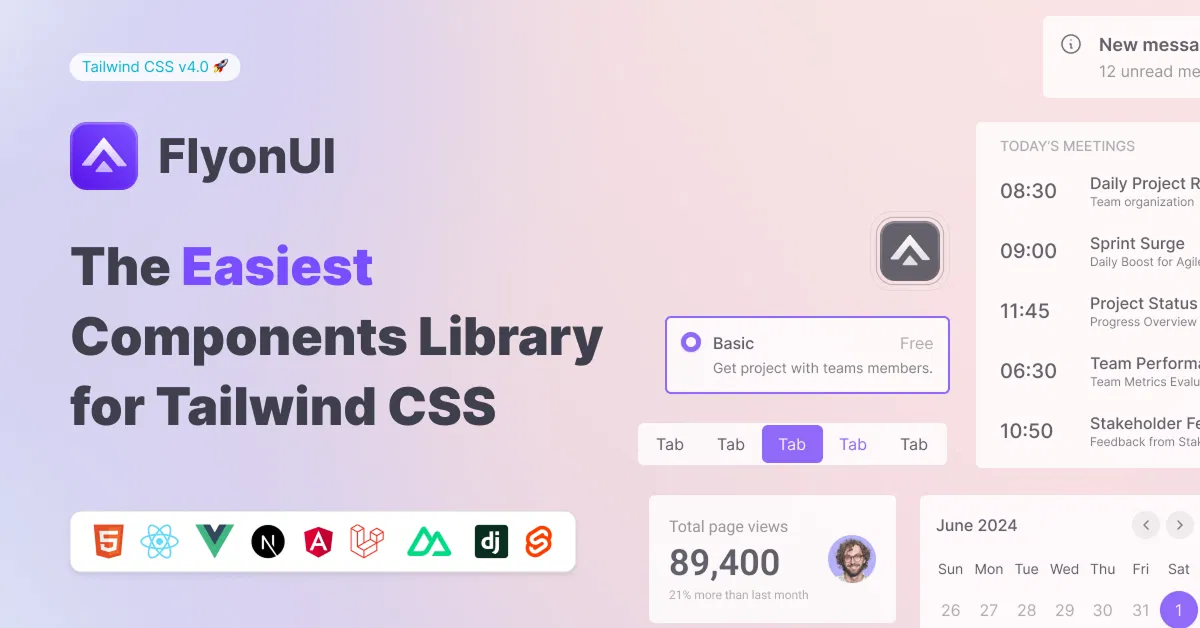
FlyonUI - Free Tailwind CSS Components
Open-source Tailwind CSS components library.

Shadcn/Studio - Theme Editor
Open-source Shadcn registry with copy-paste components.
Tailwind CSS Shadows for Stunning Visual Effects
Tailwind CSS shadow utilities add depth and visual flair to web interfaces, enhancing elements like cards, buttons, and modals. These utility classes offer customizable, responsive box and text shadows for modern designs. All UtilityCSS curates top free and premium Tailwind CSS shadow resources to elevate your web projects with sleek, professional aesthetics.
What is Tailwind CSS Shadow?
Tailwind CSS shadow utilities are pre-defined classes that apply box or text shadows to elements, creating depth and visual hierarchy. These include utilities like shadow-sm, shadow-md, and shadow-inner, used for cards, buttons, or hover effects. They enable developers to add polished, responsive shadow effects without custom CSS, ideal for modern, engaging UI designs.
Key Features
Customizable Shadows: Adjust shadow size, opacity, and color with Tailwind utilities.
Responsive Design: Apply shadow variations across breakpoints for device compatibility.
Hover Effects: Combine shadows with hover utilities for interactive transitions.
Inner Shadows: Use
shadow-innerfor unique, inset shadow styling.Lightweight Code: Minimal utility classes ensure fast page load times.
Accessibility-Friendly: Shadows enhance visual cues without compromising usability.
Layered Effects: Stack multiple shadow utilities for complex designs.
Benefits of Using Tailwind CSS Shadow
Enhanced Visual Appeal: Shadows add depth, making UI elements pop and engage users.
Rapid Styling: Utility classes enable quick shadow application without custom CSS.
Responsive Shadows: Adjust shadow effects for mobile and desktop displays.
SEO Optimization: Lightweight code improves page speed and search rankings.
Flexible Customization: Easily tweak shadow styles to match brand aesthetics.
Community Resources: All UtilityCSS offers curated shadow utility guides.
Types of Tailwind CSS Shadow
Box Shadows: Standard shadows for cards, buttons, or containers (
shadow-md,shadow-lg).Inner Shadows: Inset shadows for input fields or recessed elements (
shadow-inner).Text Shadows: Subtle shadows for typography to enhance readability or style.
Hover Shadows: Dynamic shadow changes on hover for interactive elements.
Colored Shadows: Custom shadows with Tailwind’s color utilities for branding.
Soft Shadows: Gentle, diffused shadows for a modern, clean aesthetic.
How to Choose the Best Tailwind CSS Shadow?
Check Utility Compatibility: Ensure shadow classes align with your Tailwind CSS version.
Evaluate Visual Impact: Choose shadows that enhance UI without overwhelming it.
Prioritize Responsiveness: Select utilities with breakpoint-specific shadow options.
Assess Interactivity: Opt for shadows that pair well with hover transitions.
Consider Accessibility: Ensure shadows maintain contrast for readable, inclusive designs.
Popular Use Cases
Card Components: Add shadows to product or blog cards for depth.
Button Styling: Enhance buttons with hover shadows for interactive feedback.
Modal Popups: Use shadows to make modals stand out from backgrounds.
Dashboard Elements: Apply shadows to widgets for visual hierarchy in admin panels.
Landing Pages: Create depth in hero sections with soft or colored shadows.
Portfolio Designs: Highlight images or sections with subtle shadow effects.
Final Thoughts
Tailwind CSS shadow utilities are a game-changer for adding depth and style to web interfaces with minimal effort. With All UtilityCSS, you can explore curated free and premium resources to master shadow effects. Start enhancing your designs today with Tailwind CSS shadows for a polished, modern look!
Frequently Asked Questions
Explore frequently asked questions about Shadow
Pre-defined classes for applying box or text shadows to UI elements.
Absolutely, utility classes allow easy adjustments for size and color.
Have a resource?
Submit your Tailwind CSS resource to All UtilityCSS, get featured, and drive genuine traffic while showcasing your work to the world. Turn your creativity into revenue and begin selling today! 🚀