Details about Solid UI - Kobalte and Tailwind CSS Components.
Free, open-source collection of UI components
Built with Kobalte, corvu, and Tailwind CSS
Unofficial port of shadcn/ui and tremor-raw to SolidJS
Supports copy-paste integration, not an npm package
MIT-licensed
#What is Solid UI?
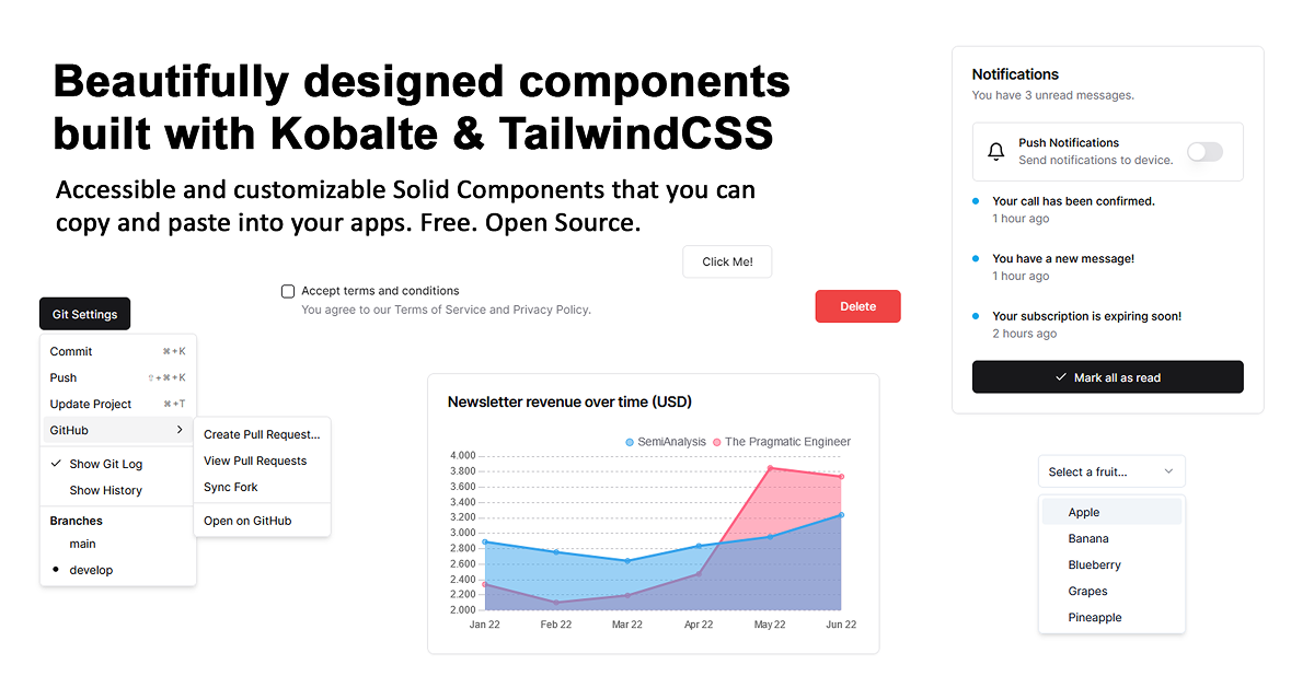
Solid UI is a free, open-source collection of UI components developed by Stefan Karger, designed to help developers build accessible and customizable interfaces with SolidJS. Its primary goal is to provide a set of reusable components that can be copied and pasted into projects, targeting SolidJS developers looking for a lightweight alternative to traditional component libraries like shadcn/ui.
Built with Kobalte for accessibility, corvu for utilities, and Tailwind CSS for styling, Solid UI offers a variety of components inspired by shadcn/ui and tremor-raw. It’s not distributed as an npm package, emphasizing a copy-paste approach that encourages developers to own and customize the code for their specific needs, making it ideal for building custom component libraries.
#Features ⚡️
Reusable Components: Includes buttons, forms, modals, and other UI elements for SolidJS projects.
Accessibility Focus: Leverages Kobalte to ensure components follow WAI-ARIA guidelines.
Copy-Paste Integration: No npm dependency; simply copy and paste components into your project.
Tailwind CSS Styling: Utility-first styling for responsive and customizable designs.
Lightweight Approach: No installation overhead, ideal for small to medium projects.
Custom Library Building: Encourages developers to use it as a foundation for their own libraries.
#Pros and Cons
#Pros ✅
Accessibility: Built with Kobalte, ensuring better WAI-ARIA compliance.
Free and Open-Source: MIT license allows unrestricted use and modification.
Flexible Integration: Copy-paste method gives developers full control over the code.
Community-Driven: Open to contributions via GitHub, fostering collaboration.
Customizable: Tailwind CSS enables easy styling adjustments to fit your project.
#Cons ⚠️
SolidJS Dependency: Limited to SolidJS projects, not compatible with other frameworks.
No npm Package: Lacks the convenience of a traditional package installation.
Manual Updates: Copy-paste approach means updates aren’t automatic; you’ll need to manually integrate new versions.
Limited Component Set: As an unofficial port, it may not cover all shadcn/ui or tremor-raw components.
#Included Components - Templates
Solid UI focuses on reusable components rather than full templates:
Buttons: Styled buttons with Tailwind CSS classes for various states.
Forms: Input fields and form layouts with accessibility support.
Modals: Dialog components for user interactions, styled with Tailwind CSS.
Cards: Card components for displaying content, customizable via Tailwind utilities.
#Pricing 💵
Solid UI operates on a Free model:
Free Access: Fully open-source under the MIT license, with no cost to use or modify.
#Integrations 🧰
Solid UI integrates with:
SolidJS: Core framework for building the components.
Tailwind CSS: Utility-first styling for responsive designs.
Kobalte: Accessibility toolkit for WAI-ARIA compliance.
corvu: Utility library for enhanced component functionality.
Frequently Asked Questions
What is Solid UI, and how does it work with Tailwind CSS?
Solid UI is a free collection of UI components for SolidJS, styled with Tailwind CSS for responsive and customizable designs.
Is Solid UI free to use?
Yes, it’s fully free and open-source under the MIT license.
Does Solid UI support accessibility?
Yes, it uses Kobalte to ensure components follow WAI-ARIA guidelines.
How customizable is Solid UI?
Highly customizable via Tailwind CSS utilities, allowing you to tweak styles as needed.
Solid UI - Kobalte and Tailwind CSS Components.
Beautiful components built with Kobalte & corvu and Tailwind CSS.
Resource Types:
UI Kits :
Shadcn UITechnology Stack :


Featured Tailwind Products
Add Featured ProductFeatured products will be displayed here.
Have a resource?
Submit your Tailwind CSS resource to All UtilityCSS, get featured, and drive genuine traffic while showcasing your work to the world. Turn your creativity into revenue and begin selling today! 🚀