
Bootstrap 5
The world's most popular framework for building responsive, mobile-first sites with prebuilt components.


3+ Bootstrap 5 Resources
Submit Resource
FlyonUI - Free Tailwind CSS Components
Open-source Tailwind CSS components library.


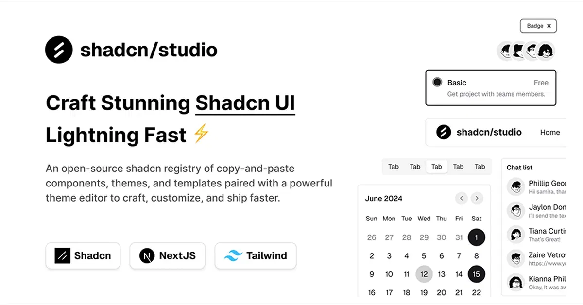
Shadcn/Studio - Theme Editor
Open-source Shadcn registry with copy-paste components.
Bootstrap: The Most Popular Front-End Framework for Rapid Web Development
When it comes to creating responsive and aesthetically pleasing websites quickly, Bootstrap has become a go-to front-end framework for web developers worldwide. Initially developed by Twitter engineers Mark Otto and Jacob Thornton, Bootstrap has evolved into the most widely used HTML, CSS, and JavaScript framework for building responsive web applications. In this blog, we'll explore what Bootstrap is, its key features, and why it's a great choice for modern web development.
At allutilitycss, You will find the best bootstrap based
What is Bootstrap?
Bootstrap is a free, open-source front-end framework that provides developers with a comprehensive set of tools for building websites and web applications. It includes a collection of pre-designed, reusable UI components such as buttons, navigation bars, forms, and modals, all based on a flexible grid system. Bootstrap ensures that web pages are not only responsive but also mobile-first, adapting seamlessly to various screen sizes and devices.
Key Features of Bootstrap:
Responsive Grid System
Bootstrap's grid system is one of its most defining features. It enables developers to create responsive layouts easily using a 12-column system that adjusts content based on the screen size. With predefined classes for different screen sizes, you can design websites that look great on all devices, from small mobile screens to large desktop monitors.Pre-designed Components
Bootstrap offers a wide range of pre-built components, including buttons, cards, navigation bars, modals, dropdowns, and more. These components are easy to customize and use, saving developers time and effort in building common UI elements from scratch.Customizable Themes
Bootstrap comes with a default theme, but it’s highly customizable. By overriding the default styles using Sass variables, you can change colors, fonts, and other visual elements to fit your brand's design without writing extensive custom CSS.Mobile-First Approach
Bootstrap follows a mobile-first design philosophy, which means the framework is optimized for smaller screens and scales up to larger screens. This ensures that your website is fully responsive and optimized for mobile devices right out of the box.JavaScript Plugins
Bootstrap includes several JavaScript plugins that enhance the interactivity of your site. These plugins include features like modals, tooltips, carousels, and dropdown menus, which can be added to your website with minimal configuration.Cross-Browser Compatibility
Bootstrap ensures that your site looks consistent across all major browsers, including Chrome, Firefox, Safari, and Internet Explorer. This cross-browser compatibility reduces the need for extensive testing and tweaks.Built-in Typography and Icons
Bootstrap provides built-in typography styles, including headings, paragraphs, lists, and text alignment. Additionally, it integrates with Font Awesome, providing access to a wide range of icons that can be easily used in your project.
Why Use Bootstrap?
Here’s why Bootstrap remains one of the most popular frameworks in the web development world:
1. Speed of Development
Bootstrap’s pre-designed components allow developers to build websites quickly without having to design elements from scratch. The grid system ensures that responsive layouts are easy to implement, cutting down on development time.
2. Consistency
Bootstrap promotes a consistent design across your web application by providing reusable components with standardized styles. This ensures that your website maintains uniformity in design and functionality.
3. Customizability
Bootstrap is highly customizable. You can tweak the framework to fit your project’s needs by overriding the default styles with your own custom styles. The use of Sass variables makes it easy to adjust colors, typography, and spacing to align with your brand.
4. Wide Support and Documentation
Bootstrap has extensive documentation and a large community of developers. Whether you’re new to the framework or an experienced user, you can easily find resources, tutorials, and examples to help you along the way. Additionally, the active community helps keep the framework up to date with modern web standards.
5. Mobile-Friendly by Default
With its mobile-first approach, Bootstrap automatically ensures that your website is optimized for mobile devices. The responsive grid system and built-in media queries make it easy to create mobile-friendly websites without additional effort.
6. Cross-Platform and Cross-Browser Compatibility
Bootstrap ensures your website works consistently across all platforms and browsers. The framework handles a lot of the tedious work of cross-browser compatibility, letting you focus on building your application.
Getting Started with Bootstrap
To start using Bootstrap, follow these simple steps:
Include Bootstrap in Your Project
You can either download the Bootstrap files and host them locally or use a CDN to link to the framework directly.Via CDN:
<link href="https://stackpath.bootstrapcdn.com/bootstrap/4.5.2/css/bootstrap.min.css" rel="stylesheet">
<script src="https://stackpath.bootstrapcdn.com/bootstrap/4.5.2/js/bootstrap.bundle.min.js"></script>
Use Bootstrap’s Pre-built Components
Once Bootstrap is added to your project, you can start using its pre-built components. For example, to create a simple button:<button class="btn btn-primary">Click Me</button>Customize the Framework
If you want to customize Bootstrap to match your design, you can download the source code and modify the Sass variables. Alternatively, you can override the default CSS in your project’s stylesheet.
Key Benefits of Using Bootstrap-Based Tailwind Resources:
Speed Up Development: With pre-built Bootstrap components and Tailwind’s utility classes, you can rapidly design and build websites without having to start from scratch.
Consistent, Customizable Designs: Bootstrap components bring consistency and functionality, while Tailwind allows you to tweak the styling to fit your brand, all within a clean, responsive grid system.
Better Control Over Styling: Tailwind CSS gives you complete control over the look and feel of your design, ensuring your application is unique and aligned with your brand guidelines.
Mobile-First Approach: Both Bootstrap and Tailwind are designed to be mobile-first, ensuring your projects are fully responsive, even as you enhance components with Tailwind’s utility classes.
Ease of Integration: Bootstrap and Tailwind CSS are both easy to integrate into your existing project, meaning you can seamlessly use Bootstrap’s components with Tailwind’s utilities.
Conclusion:
Bootstrap has earned its place as one of the most popular front-end frameworks due to its ease of use, responsiveness, and robust set of pre-designed components. Whether you are building a simple landing page or a complex web application, Bootstrap can help you create polished, mobile-first websites quickly and efficiently.
At allutilitycss, you will find the best Bootstrap-based Tailwind resource. We have curated this collection to help you find the best tools and resources to speed up your development process while maintaining a customizable, modern design.
Frequently Asked Questions
Explore frequently asked questions about Bootstrap 5
Bootstrap is a free, open-source CSS framework primarily used for building responsive, mobile-first websites. It provides a collection of pre-styled components, making it easier and faster for web developers to create layouts, forms, buttons, and other UI elements. Bootstrap also includes optional JavaScript plugins for interactive features.
Bootstrap is a front-end framework. It is a collection of pre-designed HTML, CSS, and JavaScript components designed to streamline the creation of responsive, mobile-first websites and web applications. It focuses on the visual presentation and user interface (UI) of a website, not the server-side logic or database interactions.
Have a resource?
Submit your Tailwind CSS resource to All UtilityCSS, get featured, and drive genuine traffic while showcasing your work to the world. Turn your creativity into revenue and begin selling today! 🚀