
Chakra UI
A simple, modular and accessible component library that gives you the building blocks to build React applications.


3+ Chakra UI Resources
Submit Resource
FlyonUI - Free Tailwind CSS Components
Open-source Tailwind CSS components library.

Choc UI - Chakra UI Components
Prebuilt Chakra UI Components for faster development

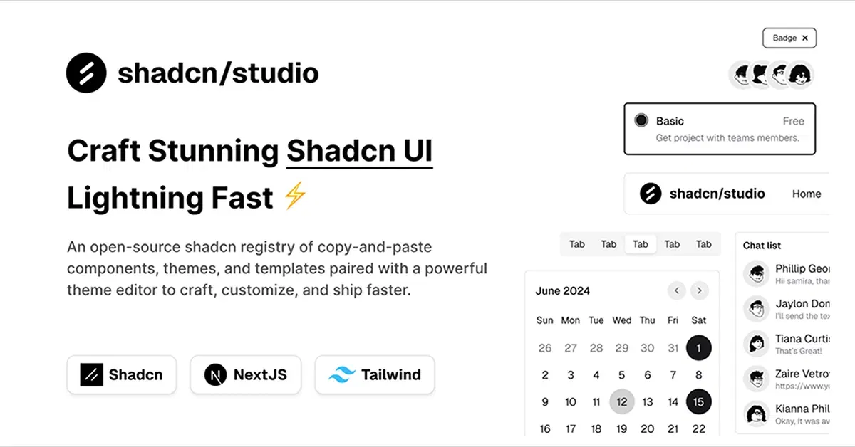
Shadcn/Studio - Theme Editor
Open-source Shadcn registry with copy-paste components.
Chakra UI: A Developer-Friendly React Component Library
In modern web development, creating aesthetically pleasing and functional user interfaces quickly and efficiently is a key priority. Chakra UI is a popular React component library designed to help developers achieve this goal. With its simple, modular, and accessible design, Chakra UI empowers developers to build responsive and customizable UIs without the need for complex CSS configurations.
In this blog, we'll explore what Chakra UI is, its key features, and why it's an excellent choice for React developers.
What is Chakra UI?
Chakra UI is a modern and flexible React component library that provides a set of pre-styled components, such as buttons, forms, modals, and navigation elements. Chakra UI is built with accessibility in mind and is fully customizable through its simple and intuitive API. It uses a style props approach that allows developers to style components directly in JSX, making it easier to build consistent and visually appealing user interfaces.
The library promotes a design system that adheres to best practices for both accessibility and responsiveness, making it a solid choice for building modern web applications.
Key Features of Chakra UI:
Accessible by Default
One of Chakra UI's strongest features is its focus on accessibility. All components are built with proper ARIA attributes, keyboard navigation, and screen reader support, ensuring your application is inclusive from the start.Modular and Customizable
Chakra UI components are modular, meaning you can import only the components you need for your project. Furthermore, the library allows for deep customization through the style props system, making it easy to adjust the appearance and layout of components to fit your project’s needs.Design System
Chakra UI includes a built-in design system that standardizes spacing, colors, typography, and more. This system helps you maintain consistency across your entire project and reduces the need for custom CSS.Responsive Design
Chakra UI components are built to be fully responsive out of the box. By using Chakra's responsive props, you can define how components should behave on different screen sizes without writing separate media queries.Theming
Chakra UI makes it easy to customize your app’s theme. You can define your own color palette, typography, spacing, and more, ensuring that your UI aligns with your branding and design guidelines.Ease of Use
Chakra UI has a simple and consistent API that makes it incredibly easy to use. The style props system allows developers to style components directly in JSX, avoiding the need for external CSS files and reducing the overall complexity of styling.Integrates Well with Other Libraries
Chakra UI can be easily integrated into other libraries and tools, such as Framer Motion for animations, React Query for data fetching, and Formik for form handling, making it a versatile solution for building dynamic web applications.
Why Combine Chakra UI and Tailwind CSS?
Combining Chakra UI and Tailwind CSS offers several key benefits:
Flexibility in Styling: Chakra UI provides pre-built components, while Tailwind allows quick, granular styling adjustments through utility classes, giving you control over the design.
Fast Prototyping: Chakra UI’s components let you rapidly build layouts, and Tailwind’s utilities help fine-tune them to match your specific design needs without custom CSS.
Customizable Theme: Tailwind CSS complements Chakra UI's built-in theme, enabling you to further customize your UI directly with Tailwind's utility classes.
Enhanced Responsiveness: Chakra UI is responsive by default, and Tailwind’s responsive classes offer even more control, allowing for better layout adjustments across different screen sizes.
Consistency with a Design System: Chakra UI provides a consistent design system, while Tailwind CSS ensures that all your custom styles align with this system, maintaining uniformity across your project.
At allutilitycss you will find Chakra UI based Tailwind CSS Components, Tailwind CSS Templates, & Tailwind Tools.
How to Get Started with Chakra UI
To get started with Chakra UI, follow these steps:
Install Chakra UI:
First, install Chakra UI and its peer dependencies:npm install @chakra-ui/react @emotion/react @emotion/styled framer-motionSet Up ChakraProvider:
Wrap your application in theChakraProviderto provide the theme context for Chakra UI components:import { ChakraProvider } from '@chakra-ui/react'; function App() { return ( <ChakraProvider> {/* Your components go here */} </ChakraProvider> ); }Use Chakra UI Components:
Once the provider is set up, you can start using Chakra UI components likeButton,Box, andText:import { Button, Box } from '@chakra-ui/react'; function App() { return ( <Box p={5}> <Button colorScheme="blue">Click Me</Button> </Box> ); }Customizing the Theme:
You can easily customize your Chakra UI theme by extending the default theme:import { extendTheme, ChakraProvider } from '@chakra-ui/react'; const theme = extendTheme({ colors: { brand: { 900: '#1a365d', 800: '#153e75', 700: '#2a69ac', }, }, }); function App() { return ( <ChakraProvider theme={theme}> {/* Your components go here */} </ChakraProvider> ); }
Why Choose Chakra UI?
Chakra UI is ideal for developers looking for a flexible, accessible, and customizable solution to building React applications. Its ease of use and integration with the React ecosystem make it a go-to choice for developers who want to create beautiful and functional UIs without getting bogged down in complex styling.
If you value accessibility, responsiveness, and a consistent design system in your development workflow, Chakra UI offers a streamlined approach to building modern web applications.
Conclusion
Chakra UI provides developers with a highly accessible, customizable, and easy-to-use library for building React applications. Its built-in design system, responsiveness, and theming capabilities make it a great choice for creating modern, user-friendly UIs. Whether you’re building a small project or a large-scale application, Chakra UI can help you save time, improve accessibility, and build beautiful user interfaces with minimal effort.
Frequently Asked Questions
Explore frequently asked questions about Chakra UI
Yes, you can combine Chakra UI's pre-built components with Tailwind CSS's utility classes for better customization.
Yes, both Chakra UI and Tailwind CSS are production-ready and widely used in web development for creating high-quality, scalable applications.
Have a resource?
Submit your Tailwind CSS resource to All UtilityCSS, get featured, and drive genuine traffic while showcasing your work to the world. Turn your creativity into revenue and begin selling today! 🚀