
Material UI
React component library that follows Google’s Material Design guidelines, providing pre-built, customizable UI components for faster development.


4+ Material UI Resources
Submit Resource
FlyonUI - Free Tailwind CSS Components
Open-source Tailwind CSS components library.


Materio – MUI Next.js Template - PRO
Next.js 15 & MUI 6 admin dashboard with elegant, unique layouts.

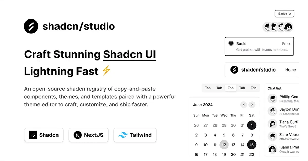
Shadcn/Studio - Theme Editor
Open-source Shadcn registry with copy-paste components.
Material UI and Tailwind CSS: The Perfect Combination for Modern Web Development
When it comes to building modern, responsive, and visually appealing web applications, developers often rely on component libraries and utility-first CSS frameworks. Among the most popular solutions are Material UI and Tailwind CSS. While both of these tools are powerful in their own right, when used together, they can significantly enhance your development workflow, improve UI consistency, and allow for greater flexibility in design.
In this blog, we’ll explore what Material UI and Tailwind CSS are, how they can complement each other, and how using both in tandem can benefit your web development projects.
What is Material UI?
Material UI is a popular React component library that implements Google’s Material Design guidelines. It provides a wide range of pre-built, customizable UI components such as buttons, sliders, dialogs, and navigation elements. Material UI focuses on delivering components with a consistent, polished look and feel, making it easier to create a user-friendly interface without having to design every component from scratch.
What is Tailwind CSS?
Tailwind CSS is a utility-first CSS framework that allows developers to style elements using pre-defined classes rather than writing custom CSS. With Tailwind, you can quickly apply utility classes like bg-blue-500, text-lg, p-4, etc., directly to HTML elements to style them. This approach is highly customizable and lets you adjust the design as you go without writing new CSS rules, giving you full control over the styling of your application.
At allutilitycss, you will find the best Material UI based Tailwind CSS Templates, Tailwind Components, & Tailwind CSS Tools.
Benefits of Using Material UI and Tailwind CSS Together
While Material UI provides an extensive library of UI components, and Tailwind CSS offers fine-grained control over styling, using both together can be highly advantageous for developers. Let’s take a closer look at how combining these two tools can benefit your web development projects:
1. Faster Development with Pre-built Components
Material UI offers a rich set of pre-built components that follow Material Design guidelines. This speeds up development, as you don’t need to start from scratch when building basic UI elements like buttons, form controls, and modals.
With Tailwind CSS, you can easily tweak the look of these components by applying utility classes directly to Material UI components. For example, you can change the padding, margins, and colors of a Material UI button without having to write custom styles, making it easy to adjust the design on the fly.
2. Customizable Styling without Overriding Styles
Material UI components come with a default set of styles that follow Material Design principles. However, there may be times when you want to tweak certain aspects of these components to align with your project’s specific design requirements.
With Tailwind CSS, you can easily override Material UI’s default styling without having to deeply customize each component's internal CSS. You can quickly change things like spacing, font sizes, and colors using Tailwind’s utility classes, giving you fine-grained control over the design while maintaining the structure provided by Material UI.
For example:
<Button className="bg-blue-500 hover:bg-blue-700 text-white p-4">
  Click Me
</Button>
Here, you can use Tailwind’s utility classes (bg-blue-500, hover:bg-blue-700, text-white, p-4) to quickly modify the Material UI button's appearance.
3. Consistent and Responsive Design
Material UI components are responsive by default, which means they adapt well to different screen sizes. However, by adding Tailwind CSS to the mix, you can further enhance the responsiveness of your layout with utility classes that provide even more granular control.
For instance, you can use Tailwind’s responsive classes like md:w-1/2 or lg:flex to adjust the layout based on different screen sizes, while keeping the base Material UI components intact.
4. Utility-First Approach with Customization Flexibility
Tailwind CSS’s utility-first approach allows you to style elements in a way that’s highly modular. You can apply different utilities to different parts of a Material UI component, allowing for fast iteration and testing. The combination of Material UI’s pre-built components with Tailwind’s utility-first classes lets you customize without writing custom CSS or dealing with complex CSS class names.
For example, you can change the background color of a Material UI Card component using Tailwind’s utility class:
<Card className="bg-gray-200 p-6">
  <Typography variant="h5">Card Title</Typography>
  <Typography>Card Content</Typography>
</Card>
5. Enhanced Developer Experience
Using Material UI and Tailwind CSS together enhances the developer experience by combining the best of both worlds. Material UI reduces the time spent on building and styling UI components, while Tailwind CSS allows you to quickly fine-tune the design without any hassle.
By integrating the two, you gain access to a massive library of components along with the flexibility of utility-first styling, which ultimately leads to a smoother and faster development process.
How to Use Material UI with Tailwind CSS?
Here’s a step-by-step guide to using Material UI and Tailwind CSS together in a React project:
Install Material UI:
npm install @mui/material @emotion/react @emotion/styledInstall Tailwind CSS:
Follow the official Tailwind CSS installation guide to install Tailwind in your project.Configure Tailwind CSS by creating a
tailwind.config.jsfile and setting up the appropriate classes.Import Material UI Components and use them in your project as needed. You can style them with Tailwind’s utility classes:
import { Button } from '@mui/material';

const App = () => (
  <Button className="bg-blue-500 text-white hover:bg-blue-700 p-3">
    Material UI Button with Tailwind
  </Button>
);
Customize as needed: Tailwind CSS will allow you to adjust the styling of the Material UI components without requiring custom CSS.
Conclusion:
Material UI and Tailwind CSS are two powerful tools that, when used together, can greatly improve your web development process. Material UI provides you with a robust set of pre-designed components that follow best practices in UI design, while Tailwind CSS offers unparalleled flexibility to fine-tune those components to match your unique design needs. By combining the strengths of both, you can quickly build scalable, customizable, and responsive web applications with ease.
Embrace the best of both worlds by integrating Material UI and Tailwind CSS in your next project and experience faster development without sacrificing design quality.
Frequently Asked Questions
Explore frequently asked questions about Material UI
Material UI is a React component library that follows Google’s Material Design guidelines, providing pre-built, customizable UI components for faster development.
Using both together allows for pre-built, customizable components with the flexibility of utility-first styling, making development faster and more flexible.
Have a resource?
Submit your Tailwind CSS resource to All UtilityCSS, get featured, and drive genuine traffic while showcasing your work to the world. Turn your creativity into revenue and begin selling today! 🚀