Tailwind CSS Checkbox
Best collection of Tailwind CSS Checkbox components, fully customizable and responsive, perfect for your forms and interactive UI elements.
Explore Checkbox


8+ Tailwind Checkbox
Submit Resource
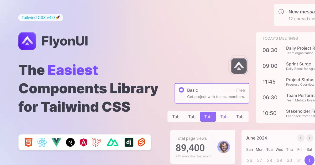
FlyonUI - Free Tailwind CSS Components
Open-source Tailwind CSS components library.

daisyUI - Tailwind CSS Component Library
Faster, cleaner, easier Tailwind CSS development


Solid UI - Kobalte and Tailwind CSS Components.
Beautiful components built with Kobalte & corvu and Tailwind CSS.

Franken UI - HTML First UI Component Library
An open-source library of UI components based on shadcn/ui.

Hover.dev - Animated UI Components
Animated UI Components for React & Tailwind CSS.

Wedges - Open-source UI components
An open-source collection of UI components for React and Tailwind CSS.

Shadcn/Studio - Theme Editor
Open-source Shadcn registry with copy-paste components.
Tailwind CSS Checkbox Components
Explore our collection of Tailwind CSS Checkbox Components, designed to make adding interactive checkboxes to your website or application fast and easy. Whether you're building forms, surveys, or to-do lists, these checkbox components provide a clean and customizable solution that seamlessly integrates into your Tailwind CSS-powered projects.
With Tailwind’s utility-first approach, these checkboxes are fully customizable, allowing you to adjust sizes, colors, borders, and hover effects with just a few utility classes. You can also implement advanced functionality such as checkboxes with labels, custom styling, or even multi-state checkboxes (checked, unchecked, and indeterminate).
What is Tailwind CSS Checkbox?
A Tailwind CSS Checkbox is a form input component styled using Tailwind CSS, a utility-first CSS framework. Checkboxes are interactive elements that allow users to select or deselect an option from a set of choices, commonly used in forms, surveys, to-do lists, or any interface that requires multiple selection options.
Using Tailwind CSS Component, the default checkbox input can be easily customized in terms of size, color, borders, and other styles without writing custom CSS. Tailwind CSS provides utility classes that help design the checkbox to fit seamlessly with the overall design of the website or application.
Why Use Tailwind CSS Checkbox Components?
Customizable: Adjust the size, color, and state of your checkboxes using Tailwind's utility classes without writing custom CSS.
Responsive: These checkboxes are designed to work seamlessly across all screen sizes, ensuring your forms look great on mobile, tablet, and desktop devices.
Simple Implementation: Add checkboxes to your forms quickly with minimal effort. Simply copy and paste the code, and customize as needed.
Consistent Design: With Tailwind CSS, you get a consistent design system that ensures your checkboxes match the overall look and feel of your project.
Accessible: Tailwind CSS checkboxes are designed with accessibility in mind, ensuring they’re easy to use for all users.
Key Features of Tailwind CSS Checkbox Components:
Customizable Styles: Easily change colors, sizes, and border styles using Tailwind's utility classes.
Multiple States: Implement checkboxes with checked, unchecked, and indeterminate states.
Labels and Icons: Add labels and custom icons next to checkboxes for better user clarity.
Accessible Design: Designed to be keyboard and screen reader-friendly for better accessibility.
Simple Markup: Clean, semantic HTML that’s easy to implement and customize.
Perfect for Every Project:
These Tailwind CSS checkbox components are ideal for:
Forms: Collect user inputs efficiently with styled checkboxes.
Surveys: Let users select multiple options with ease.
To-Do Lists: Build interactive and stylish task lists.
With Tailwind CSS checkbox components, building forms and interactive elements has never been easier. These customizable, responsive components help you create visually appealing and user-friendly interfaces with minimal effort.
Conclusion:
Tailwind CSS checkboxes offer a simple, flexible, and customizable solution for adding interactive elements to your forms and interfaces. With Tailwind's utility-first approach, you can quickly style checkboxes to match your website's design without the need for custom CSS. Whether you're building forms, surveys, to-do lists, or interactive UI elements, Tailwind CSS provides an easy and efficient way to implement checkboxes that are responsive, accessible, and visually consistent. By leveraging Tailwind’s utilities, you can create clean, modern checkboxes with minimal effort, improving both the aesthetics and functionality of your web applications.
Frequently Asked Questions
Explore frequently asked questions about Checkbox
A Tailwind CSS Checkbox is an interactive form input component styled using Tailwind CSS utilities, customizable for different design needs.
You can use Tailwind’s flexbox or grid utilities to align checkboxes with other form elements easily.
Have a resource?
Submit your Tailwind CSS resource to All UtilityCSS, get featured, and drive genuine traffic while showcasing your work to the world. Turn your creativity into revenue and begin selling today! 🚀