Tailwind CSS Forms and Inputs
Explore a collection of customizable Tailwind CSS form and input components for creating responsive, user-friendly forms with ease and style.
Explore Forms & Inputs


2+ Tailwind Forms & Inputs
Submit Resource
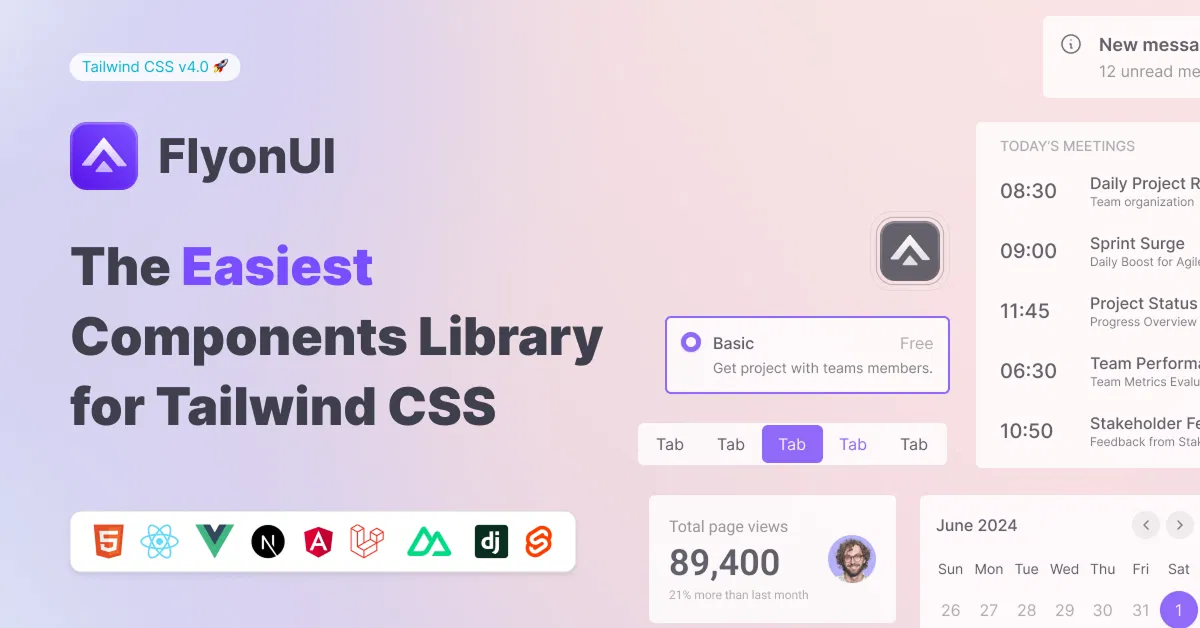
FlyonUI - Free Tailwind CSS Components
Open-source Tailwind CSS components library.

Shadcn/Studio - Theme Editor
Open-source Shadcn registry with copy-paste components.
The Best Tailwind Forms and Inputs
Forms and inputs are the backbone of interactive websites. Whether it's a login form, contact form, or data input form, they all serve as the primary means for users to interact with your website. Tailwind CSS simplifies the process of styling forms and inputs, allowing you to create visually appealing, responsive, and accessible form elements with ease.
At allutilitycss, you will get the curated collection of the best premium and free Tailwind forms and inputs.
What Are Tailwind Forms and Inputs?
Tailwind CSS provides utility classes that can be applied to form elements, such as input fields, buttons, and textareas, to style them efficiently. Tailwind’s utility-first approach means that you don’t need to write custom CSS for basic form styles. You can compose your form designs using pre-built, reusable utility classes.
Some common form elements you can style with Tailwind CSS include:
Text Inputs: Single-line text fields where users can enter data.
Password Inputs: Fields for entering sensitive data, typically obscured with asterisks.
Textareas: Multi-line fields used for longer inputs, such as comments.
Checkboxes: Interactive elements that allow users to select or deselect an option.
Radio Buttons: Used for selecting one option from a group.
Select Dropdowns: Menus allowing users to choose from a list of options.
Key Tailwind Utilities for Forms
Before diving into specific examples, let’s first take a look at some of the most commonly used Tailwind utilities for styling form elements:
Padding (
p-4,px-6,py-3): Controls the space inside form elements.Margins (
m-4,mt-6): Adds spacing around form elements.Borders (
border,border-gray-300): Defines borders around inputs, buttons, and other form elements.Background Colors (
bg-gray-100,bg-blue-500): Sets the background color of inputs and buttons.Text Colors (
text-gray-700,text-white): Adjusts the text color inside form fields.Focus States (
focus:outline-none,focus:ring-2,focus:ring-blue-500): Adds custom styles when an element is focused, enhancing accessibility and interactivity.Width (
w-full,w-64): Controls the width of form elements.Rounded Corners (
rounded,rounded-lg): Creates soft, rounded corners for a modern design.
Styling Basic Form Elements with Tailwind
Let’s explore how to style common form elements with Tailwind CSS Components for Input and Forms. We'll create a simple form layout that includes text inputs, a password field, a checkbox, and a submit button.
1. Text Input Field
Creating a simple text input field in Tailwind CSS is quick and easy:
<input type="text" placeholder="Your Name" class="border border-gray-300 p-2 w-full rounded-lg focus:outline-none focus:ring-2 focus:ring-blue-500" />
Explanation:
border: Adds a border to the input field.p-2: Adds padding inside the input.w-full: Makes the input span the full width of its container.rounded-lg: Gives the input rounded corners.focus:ring-2 focus:ring-blue-500: Adds a blue ring around the input when focused.
2. Password Input Field
A password input field hides the characters typed by the user, but we can still apply Tailwind styles:
<input type="password" placeholder="Your Password" class="border border-gray-300 p-2 w-full rounded-lg focus:outline-none focus:ring-2 focus:ring-blue-500" />
This input field is styled the same way as the text input but is designed to handle sensitive information.
3. Textarea
For longer text inputs, like comments or messages, use the textarea element:
<textarea placeholder="Your Message" class="border border-gray-300 p-2 w-full rounded-lg focus:outline-none focus:ring-2 focus:ring-blue-500" rows="4"></textarea>
Explanation:
The
rows="4"attribute defines the height of the textarea.The rest of the classes are similar to the text input for consistency in design.
4. Checkbox
To create checkboxes, Tailwind makes it simple with the following structure:
<label class="inline-flex items-center">
  <input type="checkbox" class="form-checkbox h-5 w-5 text-blue-500" />
  <span class="ml-2 text-gray-700">I agree to the terms and conditions</span>
</label>
Explanation:
form-checkboxapplies Tailwind’s styling for checkboxes.text-blue-500changes the color of the checked box.ml-2: Adds left margin to space the label from the checkbox.
5. Radio Buttons
Radio buttons are used when only one option from a set can be selected. Here's how you can style them:
<label class="inline-flex items-center">
  <input type="radio" name="option" class="form-radio h-5 w-5 text-blue-500" />
  <span class="ml-2 text-gray-700">Option 1</span>
</label>
Explanation:
form-radioapplies styling to radio buttons, similar to how checkboxes are styled.The
ml-2class is used to add space between the radio button and the label.
6. Submit Button
A well-styled button is an essential part of any form. Tailwind makes it easy to create a sleek and modern button:
<button type="submit" class="bg-blue-500 text-white py-2 px-4 rounded-lg hover:bg-blue-700 focus:outline-none focus:ring-2 focus:ring-blue-500">
  Submit
</button>
Explanation:
bg-blue-500: Sets the button’s background color.text-white: Makes the text inside the button white.py-2 px-4: Adds padding for better spacing inside the button.rounded-lg: Gives the button rounded corners.hover:bg-blue-700: Changes the background color on hover for better interactivity.
Advanced Form Styling with Tailwind
While the basics are easy to implement, Tailwind CSS also allows for advanced form styling, such as creating multi-step forms, form validation states, or custom select dropdowns. You can also integrate Tailwind with JavaScript to add additional interactivity like form validation, input masking, and error handling.
Example: Multi-Step Form
You can create a multi-step form with Tailwind by using Flexbox or Grid layouts to control the form steps, and JavaScript to navigate through the steps.
<div class="flex space-x-4">
  <div class="step w-1/3 bg-gray-200 p-4 rounded-lg">Step 1: User Information</div>
  <div class="step w-1/3 bg-gray-200 p-4 rounded-lg">Step 2: Address</div>
  <div class="step w-1/3 bg-gray-200 p-4 rounded-lg">Step 3: Payment</div>
</div>
Explanation:
Flexbox is used to lay out the three steps in a row.
Each step has a background and padding for visual separation.
Best Practices for Tailwind Forms
When working with forms in Tailwind CSS, there are a few best practices to keep in mind:
Accessibility: Ensure that your form elements are accessible. Use appropriate
labeltags,ariaattributes, andfocusstates to help users navigate through your form easily.Consistent Spacing: Maintain consistent spacing between form elements to improve readability. Tailwind’s spacing utilities (
p-4,m-4) make it easy to apply consistent margins and padding.Responsive Design: Tailwind’s responsive utilities (
sm:,md:,lg:) allow you to adapt form elements to different screen sizes, ensuring your forms look great on mobile devices.Form Validation: Tailwind can be paired with JavaScript or a library like Alpine.js to add form validation, error messages, and dynamic styling when fields are filled out incorrectly.
Custom Components: While Tailwind provides excellent out-of-the-box styles for forms, you can customize each element as needed to match your branding and project requirements.
Conclusion:
Tailwind CSS offers a powerful, flexible approach to styling forms and inputs, allowing developers to create visually appealing, responsive, and accessible form elements quickly. With its utility-first design, you can easily style each form element to suit your project, ensuring that it not only looks great but also functions seamlessly on all devices.
By mastering Tailwind forms and inputs, you can streamline your web development process, deliver a polished user experience, and ensure accessibility standards are met.
Well, you can simply find the best collection of Tailwind CSS Components like Layout components on allutilitycss, such as:
Frequently Asked Questions
Explore frequently asked questions about Forms & Inputs
You can create a text input using the border, p-2, w-full, and focus:ring-2 classes for styling.
Simply use the `<textarea>` tag with classes like border, p-2, w-full, and focus:ring-2 for styling.
Have a resource?
Submit your Tailwind CSS resource to All UtilityCSS, get featured, and drive genuine traffic while showcasing your work to the world. Turn your creativity into revenue and begin selling today! 🚀