Tailwind CSS Layout Components
Explore a collection of Tailwind CSS layout components for building responsive, customizable, and performance-optimized web designs. Create flexible layouts with ease.
Explore Layout Components


2+ Tailwind Layout Components
Submit Resource
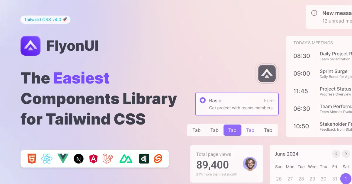
FlyonUI - Free Tailwind CSS Components
Open-source Tailwind CSS components library.

Shadcn/Studio - Theme Editor
Open-source Shadcn registry with copy-paste components.
Curated Collection of Best Tailwind Layout Components
When it comes to web development, layout is one of the most important elements that determine the user experience. A well-structured layout ensures that your content is organized and accessible, while also contributing to a visually pleasing design. Tailwind CSS layout components are an excellent solution for building flexible, responsive, and highly customizable layouts. With Tailwind’s utility-first approach, developers can easily create complex layouts without writing custom CSS from scratch.
What Are Tailwind Layout Components?
Tailwind CSS layout components are pre-built, customizable design elements that help you quickly organize and structure your website’s content. These components are designed to provide a consistent, responsive layout system for your web projects, whether you’re building a simple webpage or a complex, multi-page site.
These layout components include grids, flexbox utilities, containers, and more, all designed with flexibility in mind. By using utility classes, you can adjust spacing, alignment, positioning, and more, without needing to manually write CSS for each element.
Why Use Tailwind Layout Components?
Here are some reasons why Tailwind layout components are a great addition to your web development toolkit:
Faster Development: Tailwind CSS eliminates the need to write custom CSS for layout structures. You can quickly create flexible layouts using pre-built utility classes, saving you time and effort.
Fully Customizable: With Tailwind’s utility-first approach, you have complete control over the layout. You can easily modify things like grid columns, flex directions, and alignment without having to rewrite large chunks of CSS.
Responsive Design: Tailwind components come with built-in responsiveness, meaning they automatically adapt to different screen sizes. Whether it’s a grid layout or flexbox, your layout will look great on desktops, tablets, and mobile devices.
Clean and Maintainable Code: Since Tailwind encourages the use of utility classes directly in the HTML, the structure of your code remains clean and easy to maintain. This reduces the complexity of your stylesheets and makes future updates simpler.
No Overhead: Tailwind CSS layouts are lightweight, with only the classes you need being included. This ensures minimal CSS overhead, improving page load times and overall performance.
Key Features of Tailwind Layout Components
Grid System: Tailwind’s grid utilities allow you to create complex layouts with multiple rows and columns. You can control the number of columns, adjust their widths, and even change the grid layout at different breakpoints.
Flexbox Layout: Tailwind provides an easy-to-use flexbox utility, enabling you to align items horizontally or vertically, space them evenly, and order them with ease.
Containers: Tailwind’s container class allows you to define a responsive container for your content, ensuring proper alignment and consistent padding across different screen sizes.
Spacing Utilities: Tailwind’s spacing utilities give you full control over padding, margin, and gap sizes, allowing you to fine-tune the layout without additional CSS.
Alignment and Positioning: Tailwind provides utilities for aligning and positioning elements, including text alignment, vertical and horizontal centering, and absolute or relative positioning.
Responsive Design: Tailwind components are built to be mobile-first. Using media queries and responsive classes, you can easily design layouts that adapt seamlessly to any screen size.
Customizable Breakpoints: Tailwind’s flexible breakpoint system allows you to define custom screen sizes, enabling your layouts to adjust dynamically at different resolutions.
How Tailwind Layout Components Enhance Web Design?
Tailwind CSS layout components help streamline the web design process by allowing you to focus more on functionality and content rather than spending excessive time on CSS. These components are perfect for developers who want to create dynamic, user-friendly websites while maintaining flexibility and performance.
Whether you’re building a grid-based portfolio, a multi-column blog, or a flexible landing page, Tailwind’s layout components give you the tools to create beautifully organized, responsive websites that adapt to any screen size. Additionally, Tailwind makes it easy to implement modern web design practices, such as mobile-first design and content-driven layouts, without needing to manually craft every detail.
Conclusion:
Tailwind layout components are a powerful and flexible tool for creating responsive, maintainable, and customizable layouts for any web project. With its utility-first approach, Tailwind allows you to build complex layouts quickly while ensuring consistency and scalability. By using pre-built components, you can focus on the creative aspects of your project, knowing that your layout will be clean, fast, and easy to maintain.
For developers looking to create dynamic websites efficiently, Tailwind CSS layout components offer the perfect foundation for building modern, responsive, and highly customizable layouts. Whether you're a beginner or an experienced developer, Tailwind’s flexibility and ease of use make it an invaluable tool for your web development workflow.
Well, you can simply find the best collection of Tailwind CSS Components like Layout components on allutilitycss, such as:
Frequently Asked Questions
Explore frequently asked questions about Layout Components
Pre-designed, customizable elements that help structure and organize content in web projects using Tailwind CSS.
Yes, you can easily modify the layout using Tailwind’s utility-first classes for spacing, alignment, and more.
Have a resource?
Submit your Tailwind CSS resource to All UtilityCSS, get featured, and drive genuine traffic while showcasing your work to the world. Turn your creativity into revenue and begin selling today! 🚀